Spectrum TV
Video
Player A/B
Experiment
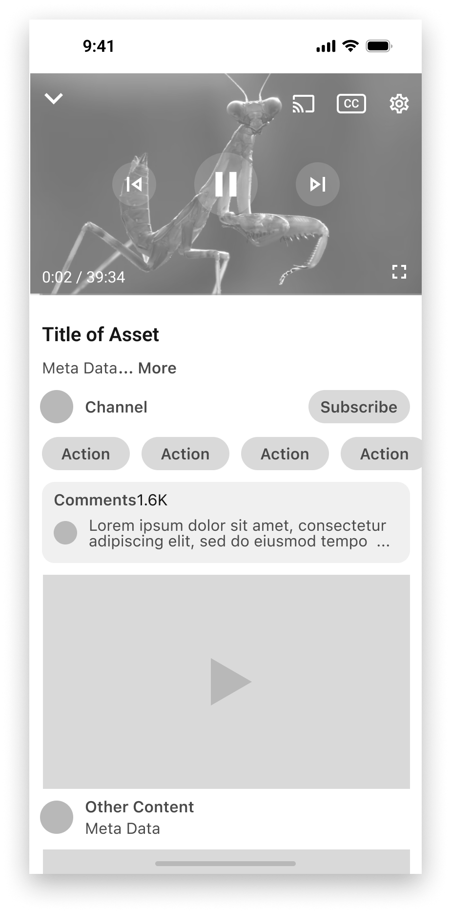
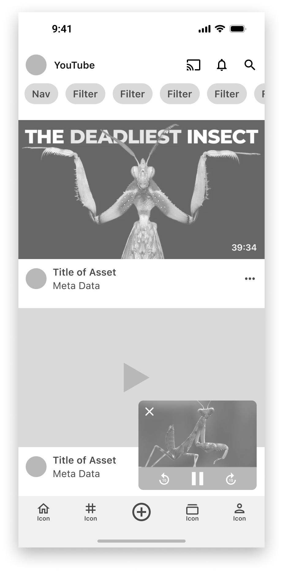
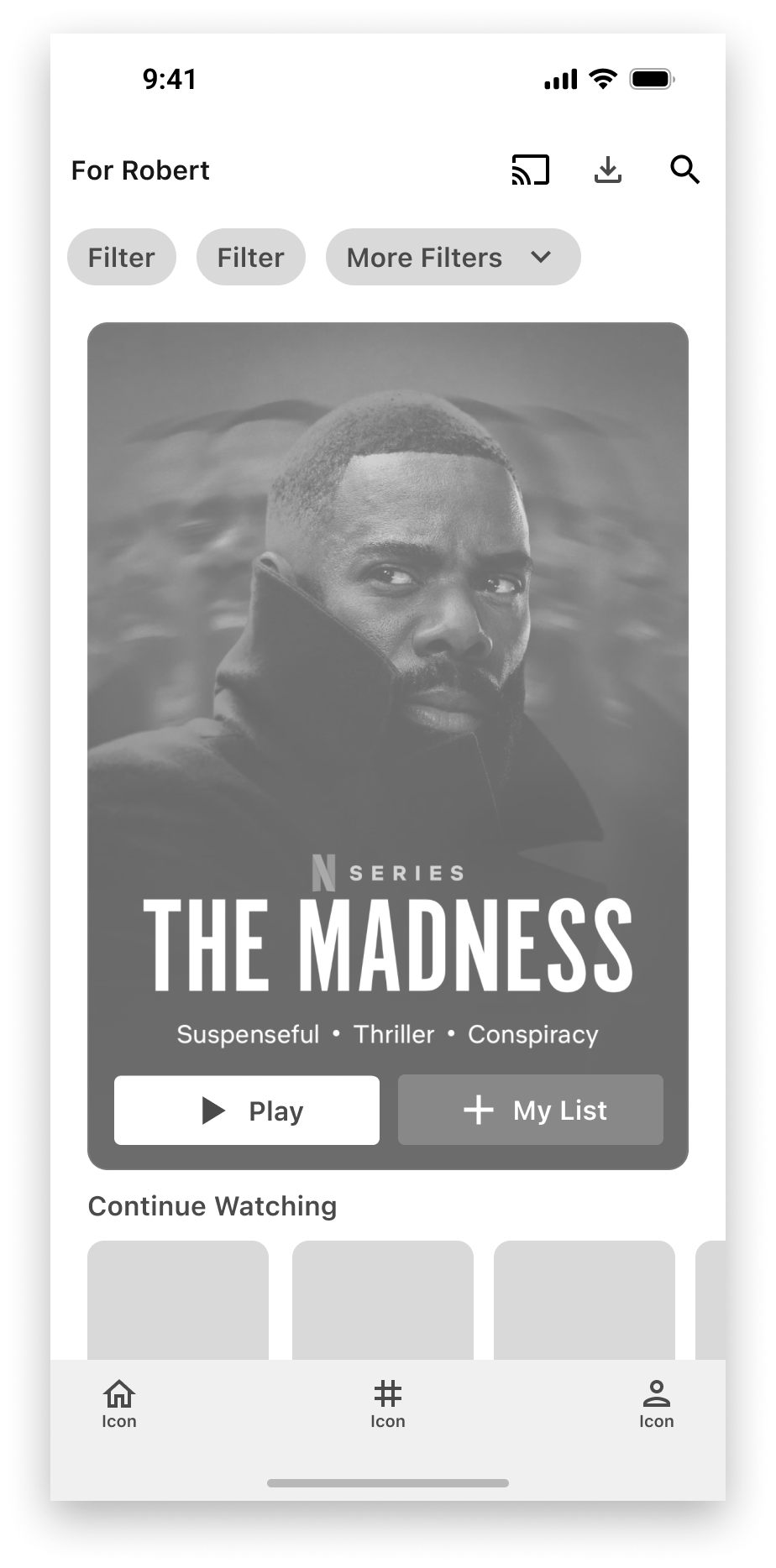
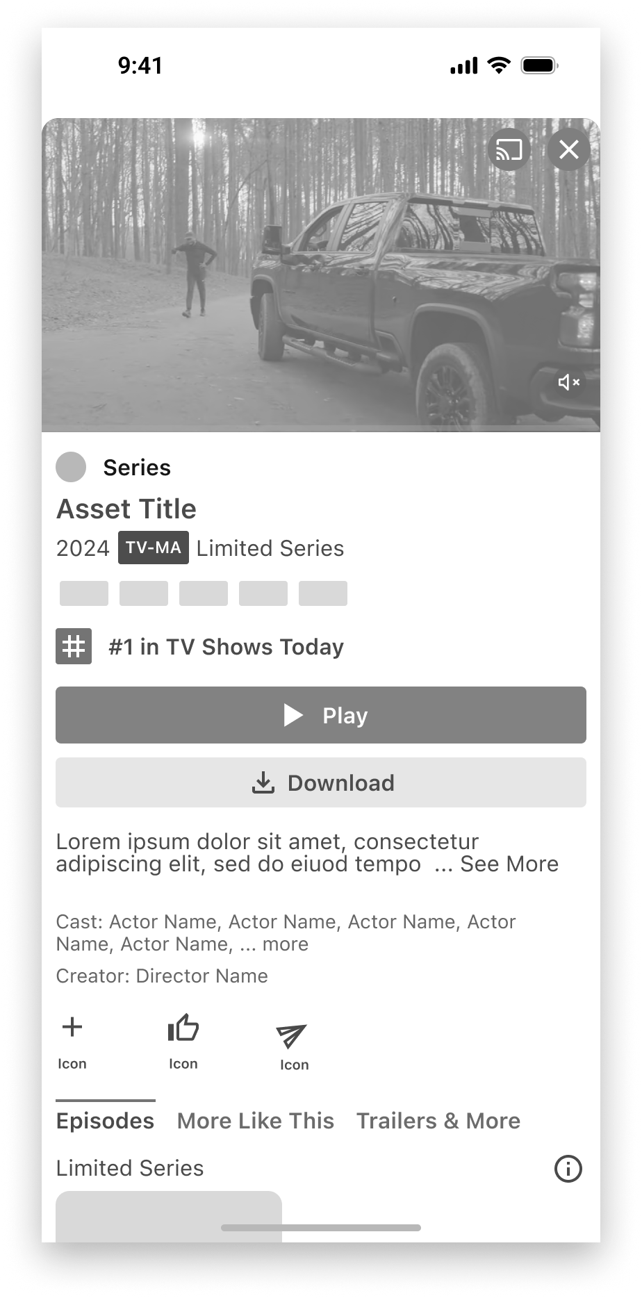
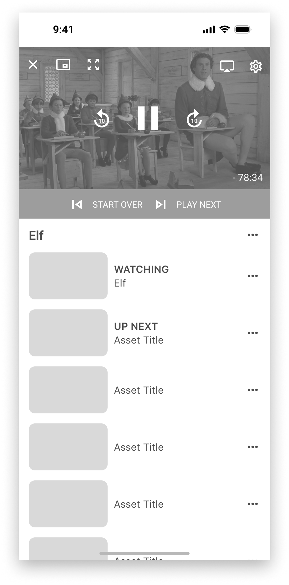
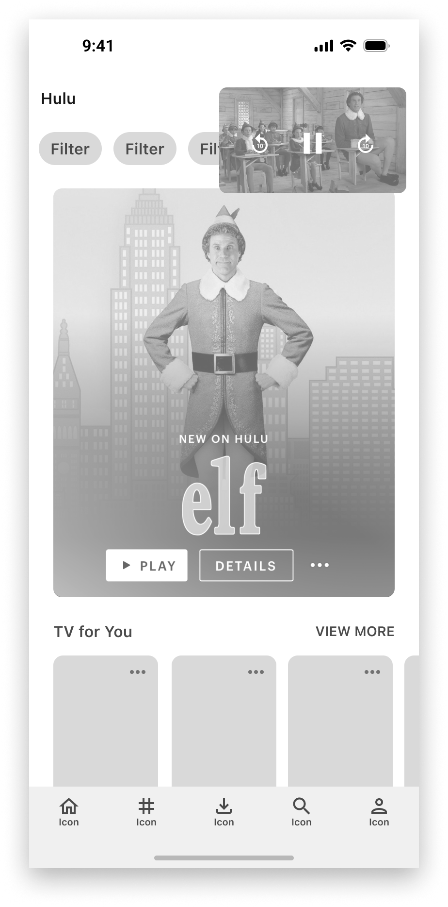
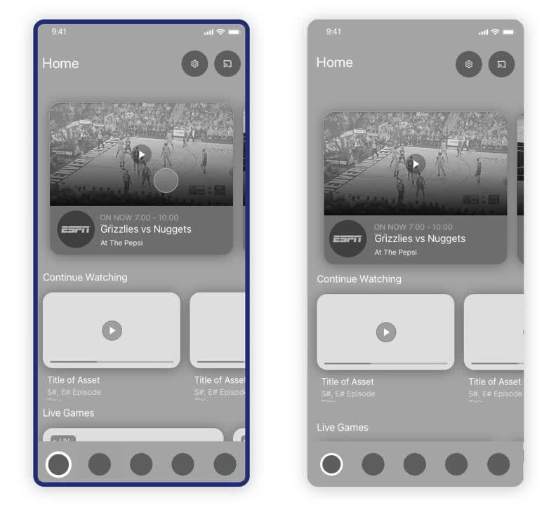
Spectrum TV Video Player A/B Experiment
Company
Spectrum TV Stream
Platforms
iOS, Android
Tools
Sketch, Principle for Mac
Date
Summer 2022
My Role
UX, Prototyping, Experimentation Concept
Scroll Down to View