Rob AyerstClose Icon

TruU
Mobile
Redesign

TruU Mobile Redesign

Company

TruU, Inc

Platforms

iOS

Tools

Figma

Date

Spring / Summer 2024

My Role

Product Owner, Creative Direction, UX & UI Design

View the Project
Scroll Down to View

Rethinking Passwordless
From the ground up

Let's take a look at how I went about redesigning a unique cybersecurity mobile app. As Product Owner, UX Designer and UI Designer, I worked with a scrappy team of (two) developers to breathe life into a dated and clunky product as we worked to shift the app architecture from UIKit to SwiftUI.

But first ...
How does authentication work?

We've all interacted with with cyber security, but not many of us have looked too closely under the hood. Since this product revolves around re-inventing an industry that isn't familiar, let's get on the same page and look at a very high-level overview at how passwords typically work currently, and how the TruU solution does it in a unique way.

how does mobile fit in?

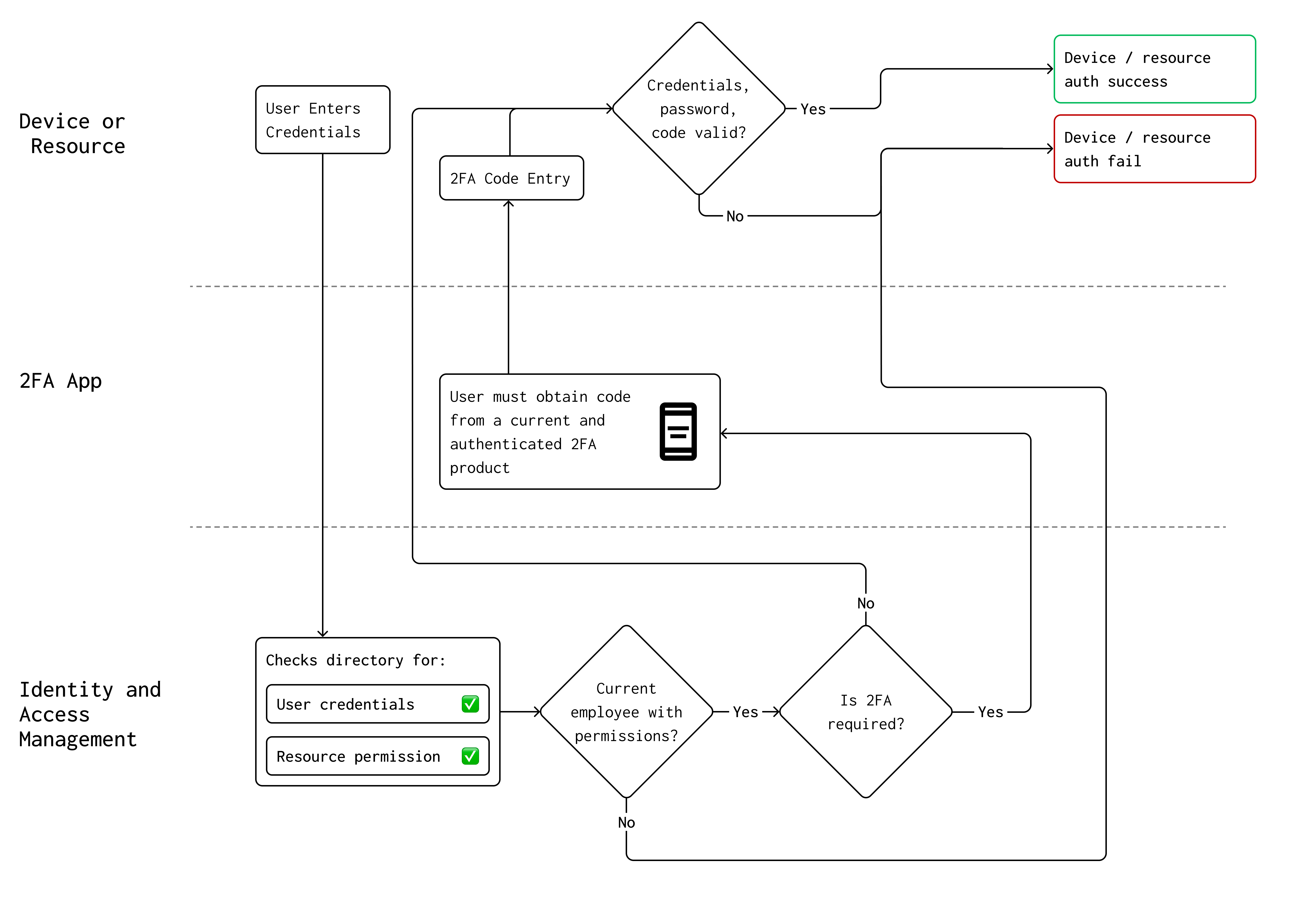
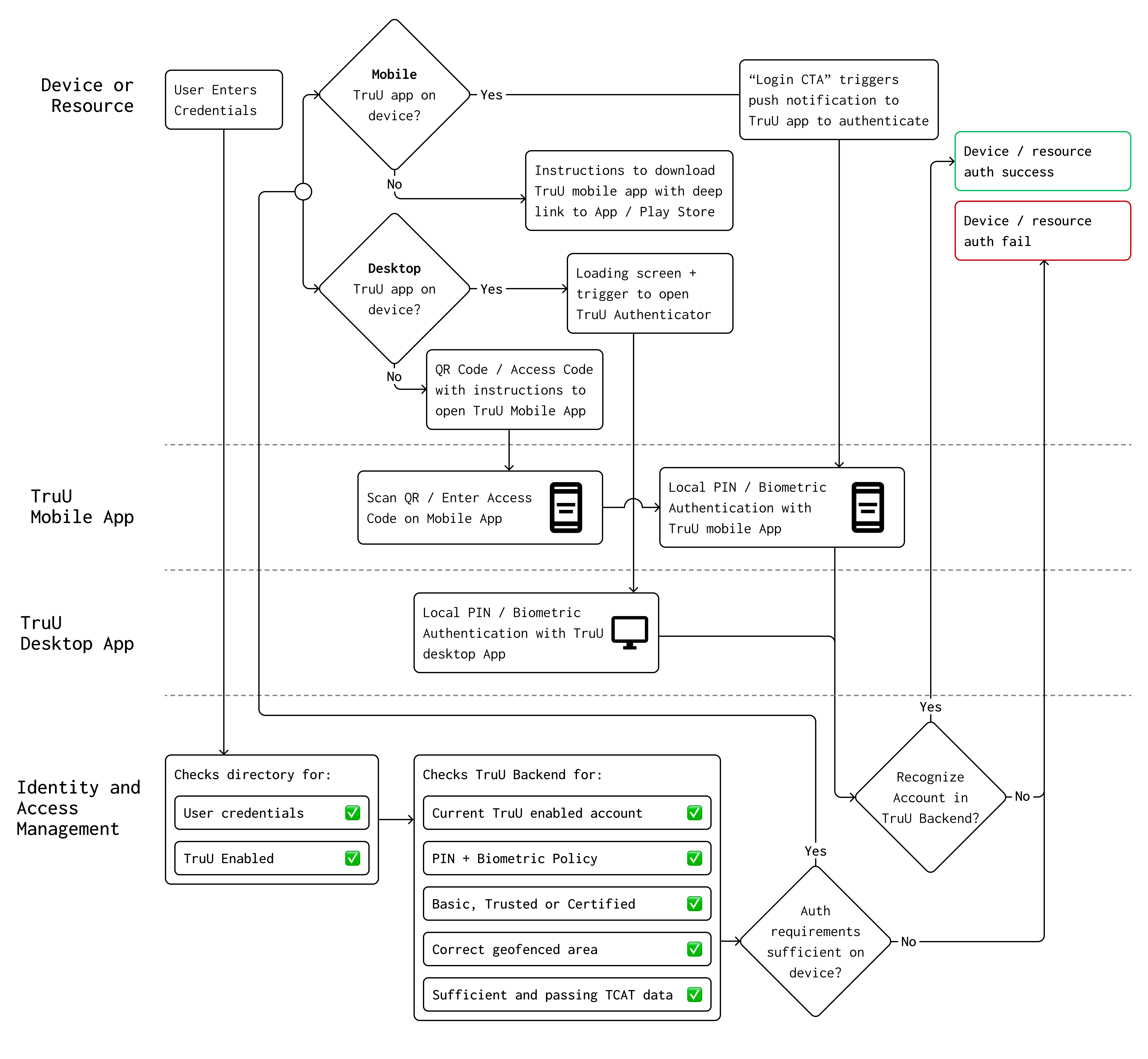
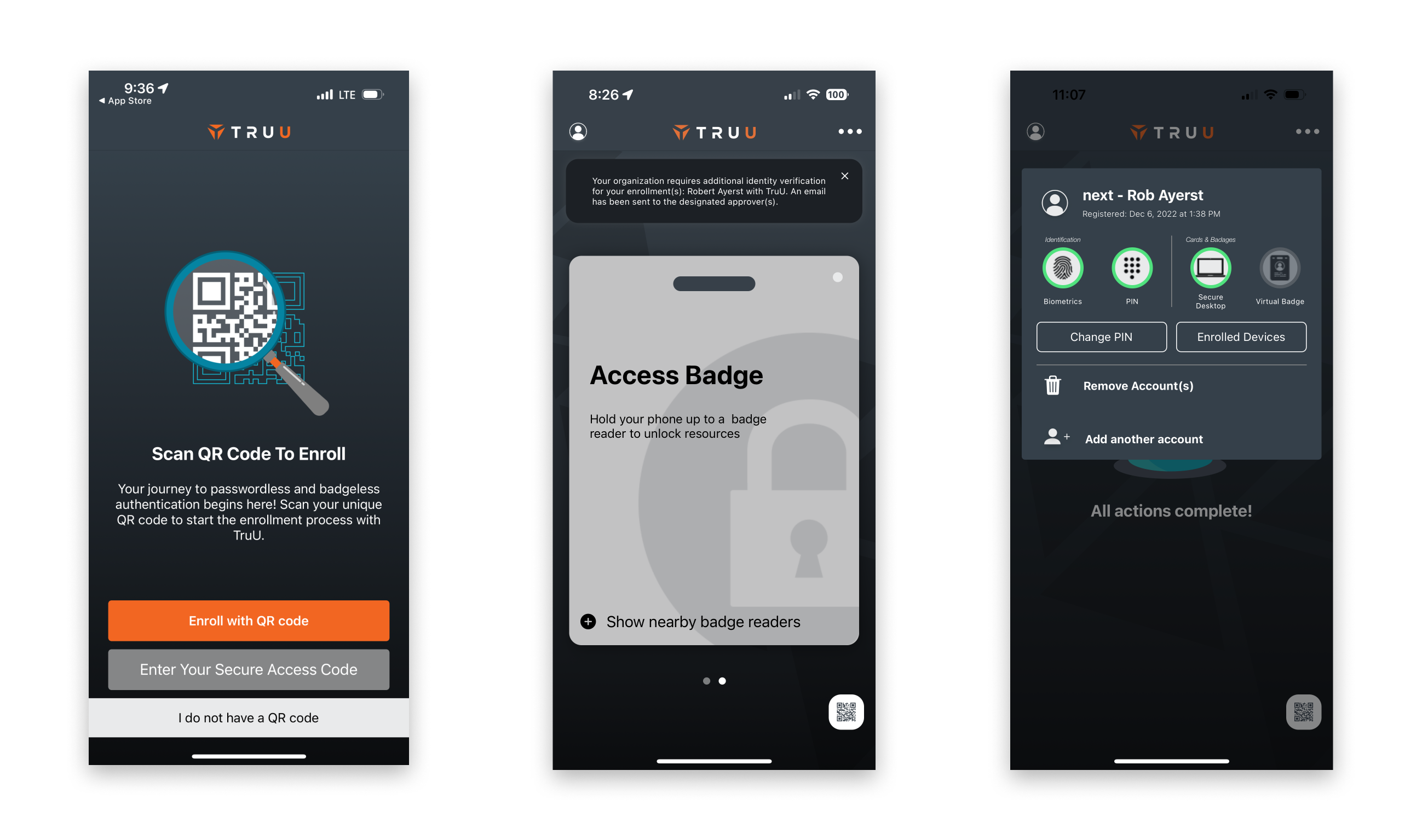
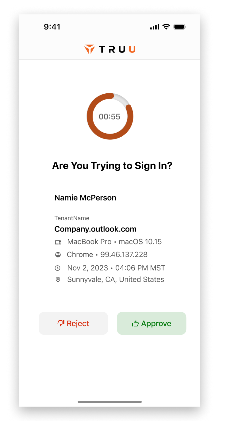
The TruU Authentication is a complex system accommodating multiple methods, and flexibility is key. Mobile is one piece of the puzzle and opens secure pathways to authenticate apps on the device, access physical spaces, and to authenticate services on non-TruU desktop computers. The primary actions require obvious routes to complete, but secondary tasks also needed to be clearly laid out. Here's a quick breakdown of what the app is used for.

The main thing - Authentication

Authenticate Apps on Device

Using a TruU enabled mobile phone to authenticate into services and websites by use of deep linking from the originating app to TruU

Authenticate Apps on a Companion Device

Authenticate on a companion device - using a TruU enabled mobile device to log into a service or website without a computer that isn't TruU enabled

Authenticate Physical Resources

Physical Authentication - use a TruU enabled mobile device to gain access to secure doors and other physical resources. This can actually be done without opening the TruU app depending on admin configuration, but there should be clear indication that the card reader functionality is set up and working.

But also, these things are important

Biometric + PIN Setup & Change

On-device PIN and Biometric options are much more secure than passwords. The app needed a way to easily set them up during onboarding as well as the ability to reset if needed.

Understanding Account Status

After an account is set up, it's vitally important for a user to have quick access to their status - Basic, Trusted or Certified. These can alter access to resources, and up-front display of it keeps help desk calls to a minimum.

Onboarding & Account Setup

Onboarding with TruU offers a robust and admin-customizable security to make sure that only the intended person is able to setup and use their account for authentication.

Key areas to improve

Taking an existing app with a lot of issues to redesign as a solo designer was a challenge, but it was important for the success of the business. Still weary from a multi-year redesign effort previous to my employment, management dreaded making big changes. As luck would have it, I had stepped into a Product Owner position along with being solo Designer ... so I was essentially a passionate designer with the keys to the development team.

Home Page & Authentication

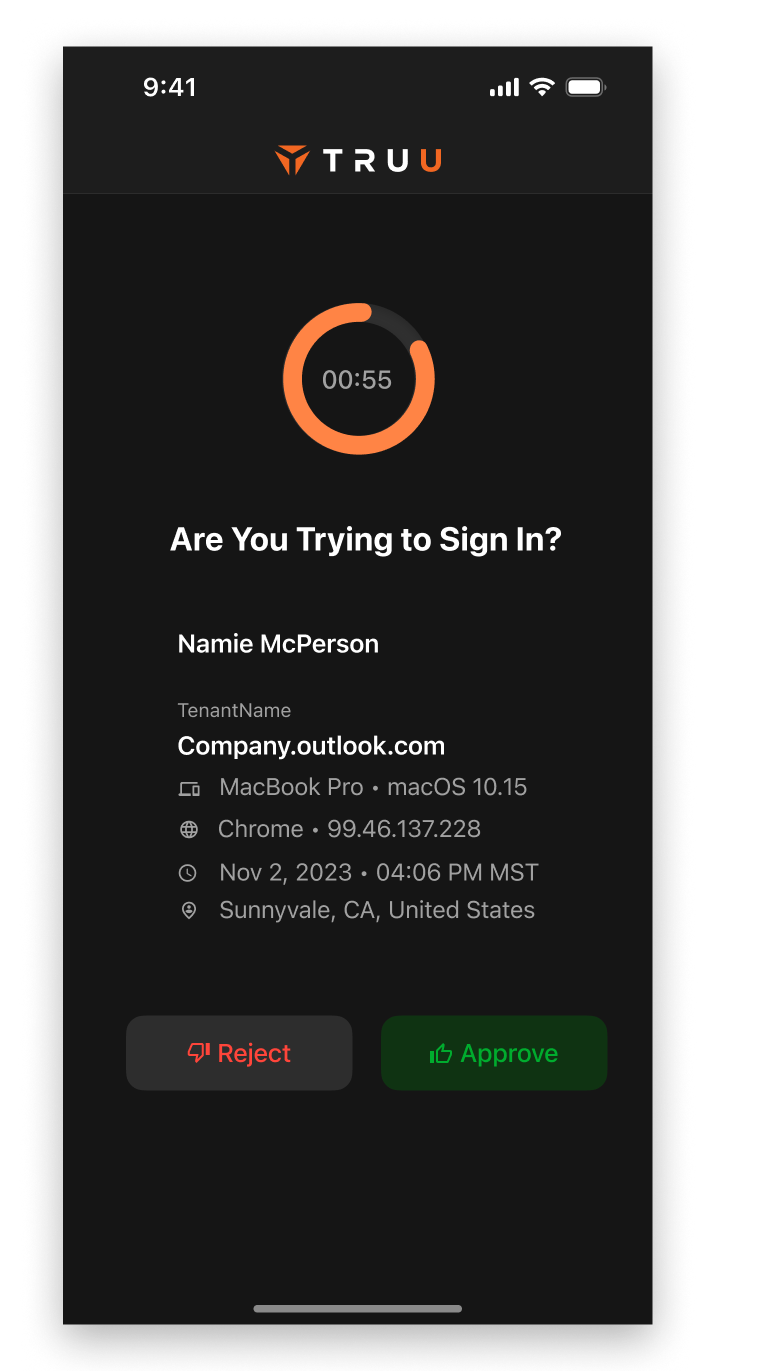
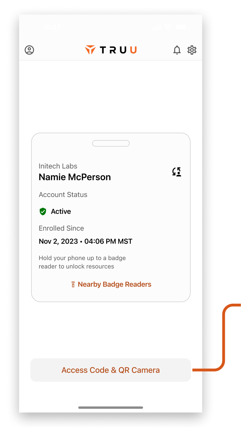
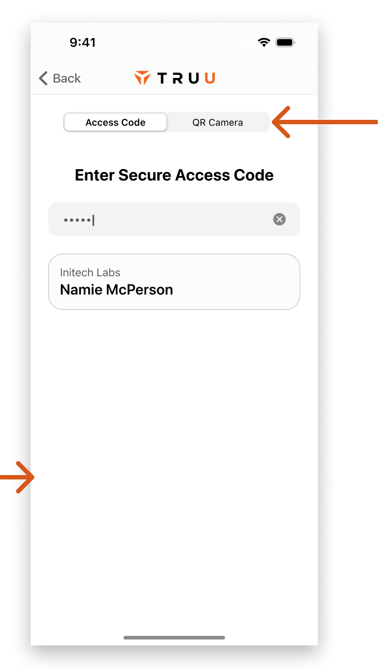
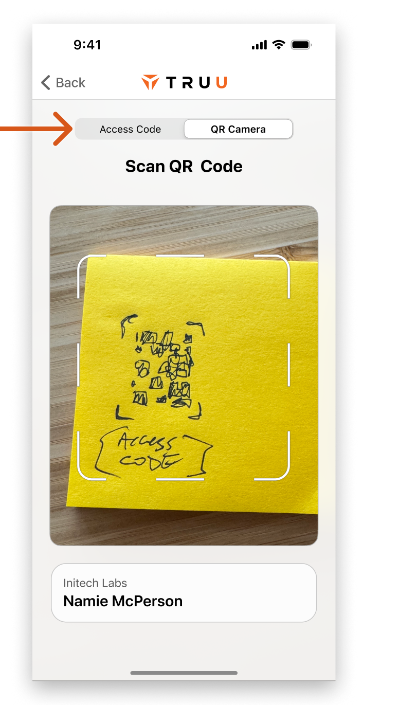
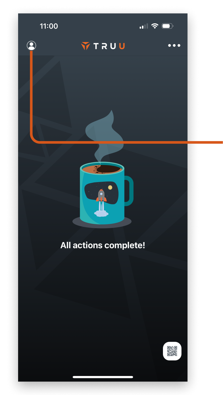
Opening the app to authenticate and respond to action requests is the bread and butter of the app. While relatively simple, a few UX and UI issues were discovered that required attention.

Light / Dark & custom theming

Mid-term goals of custom theming, an appetite for light theme and a litany of WCAG contrast issues dictated an effort to improve the UI across the board.

Account & Settings

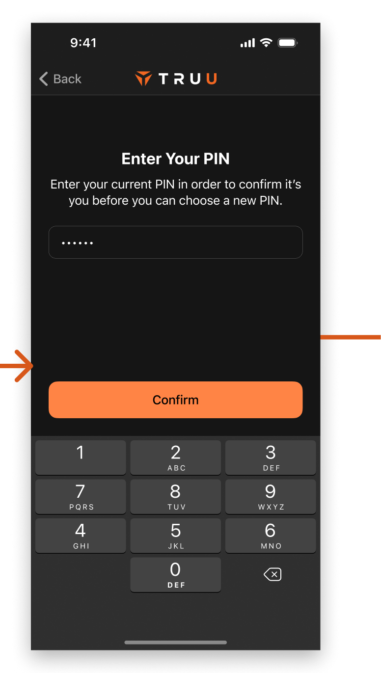
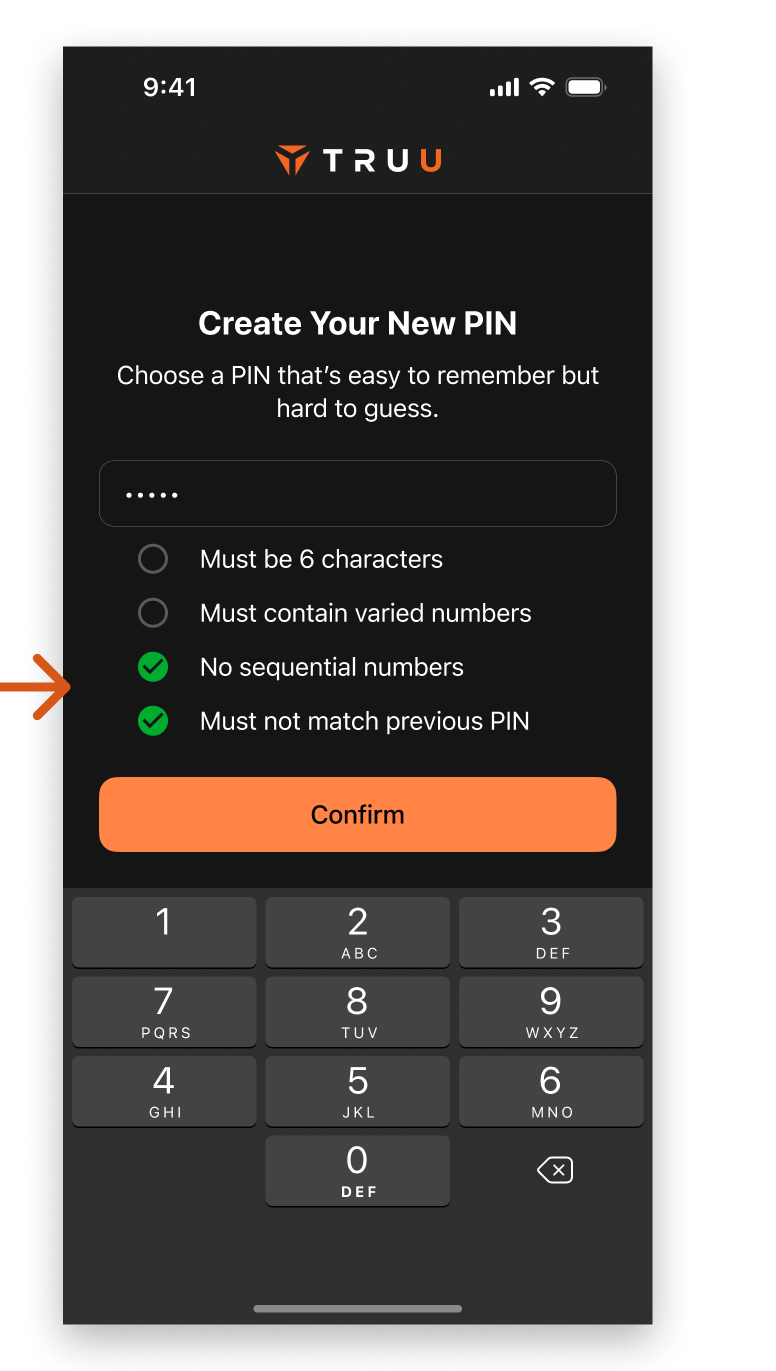
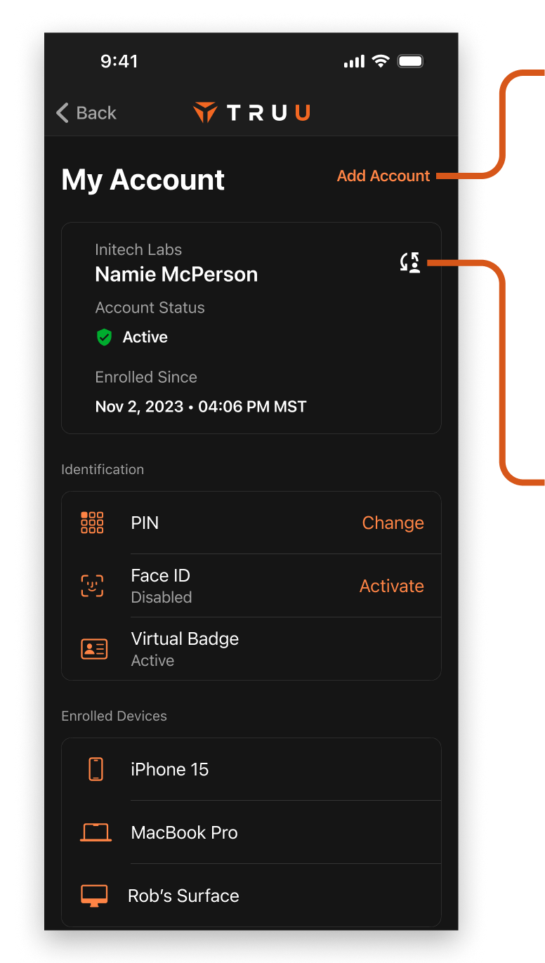
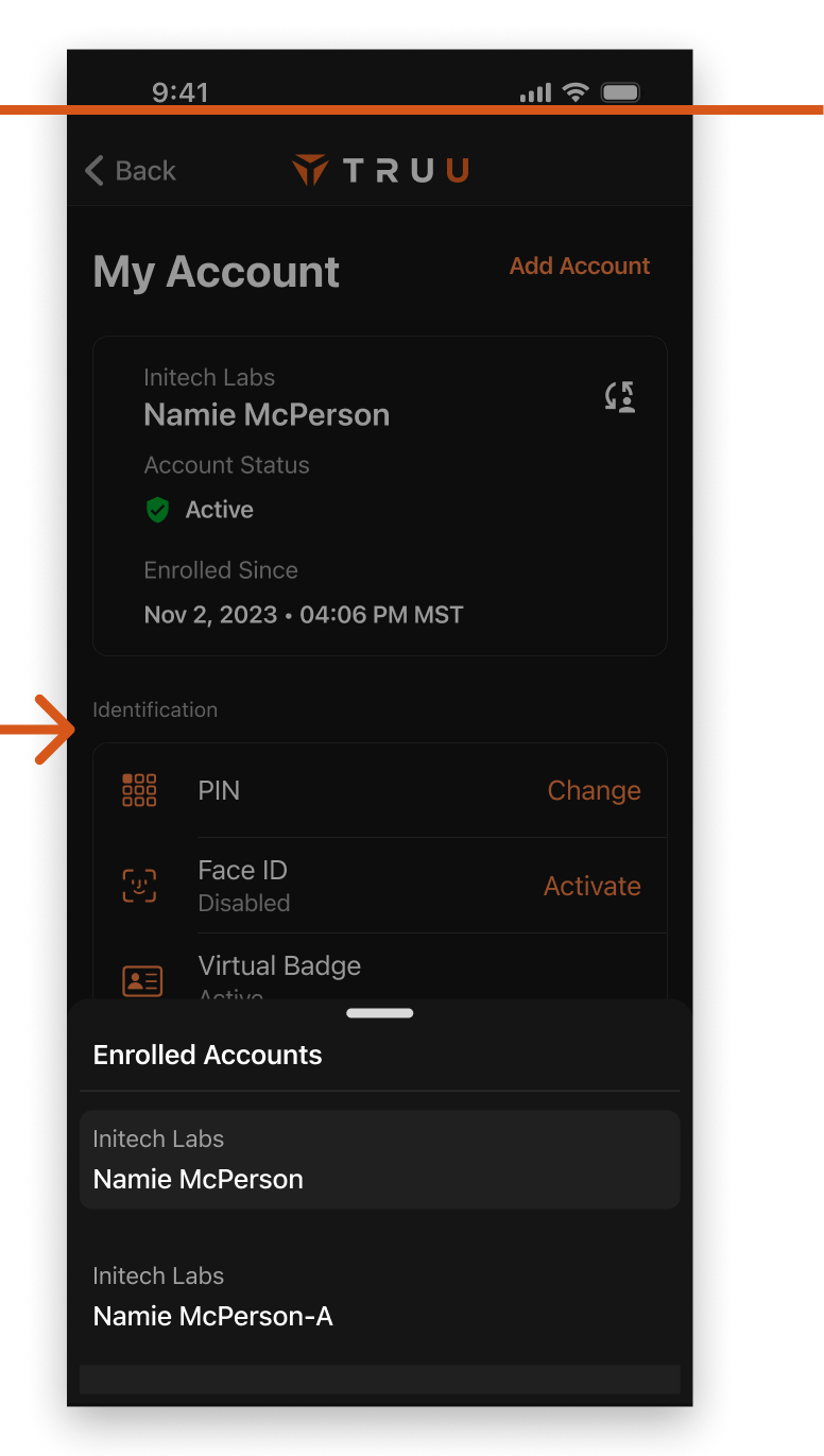
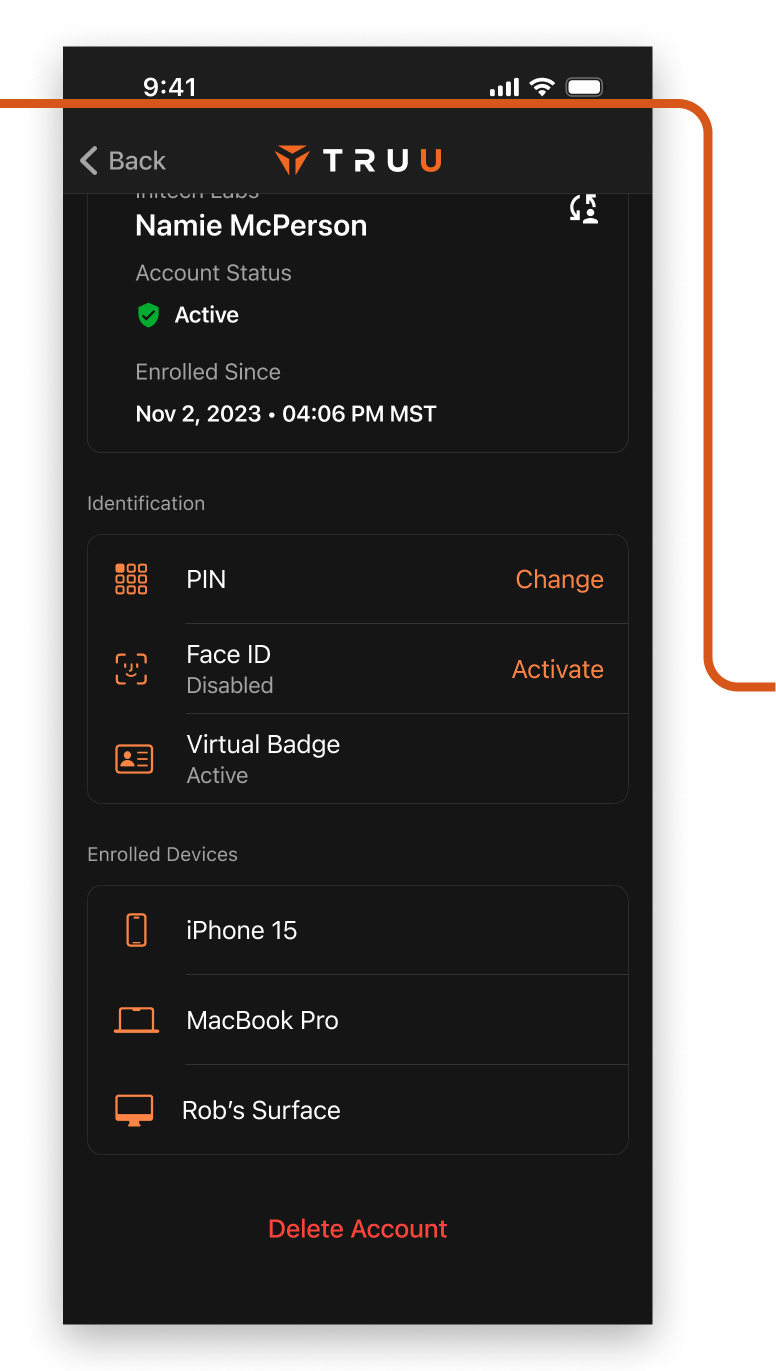
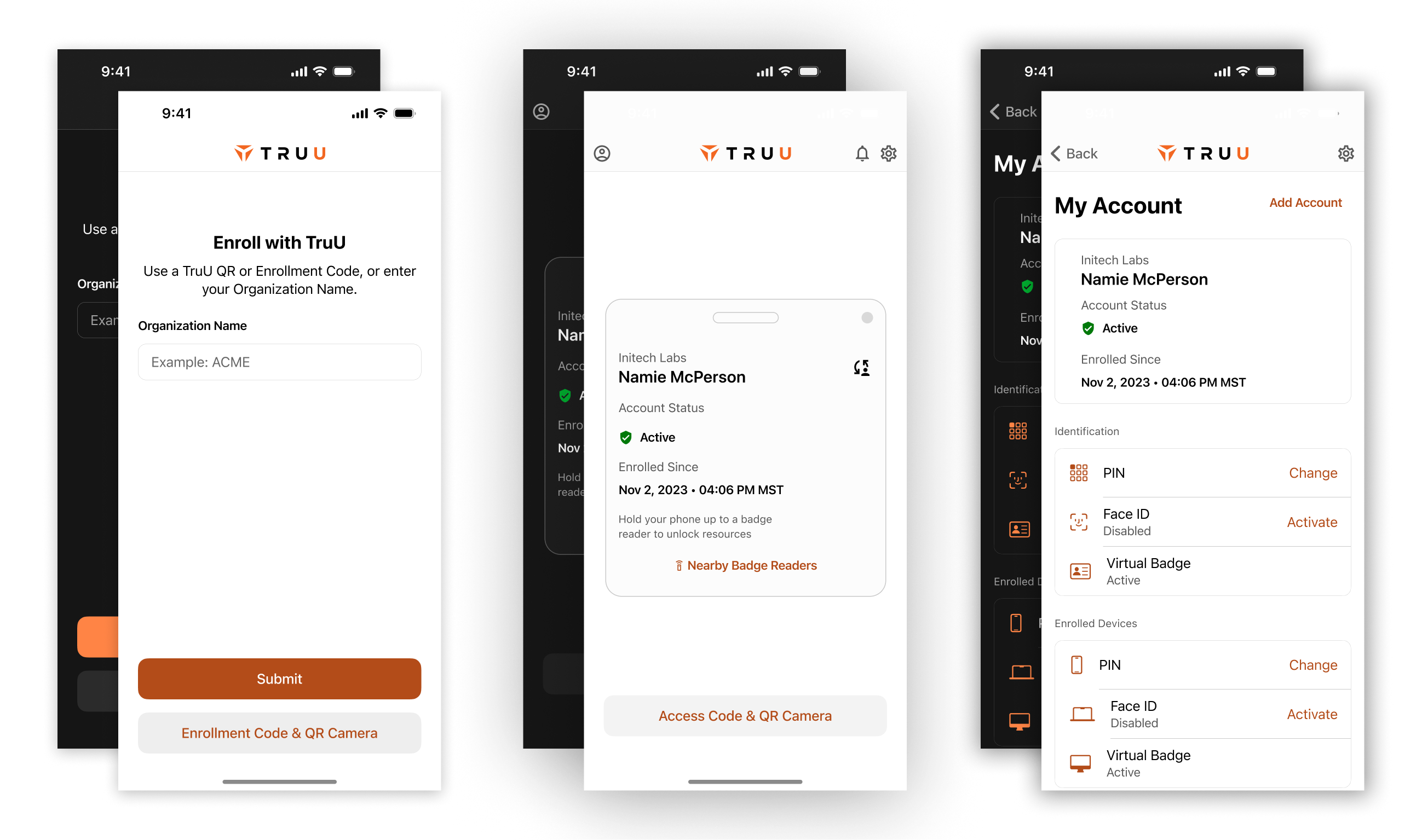
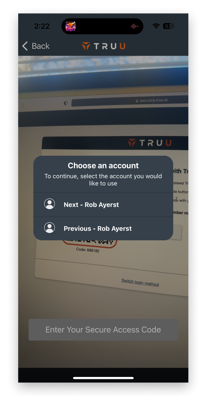
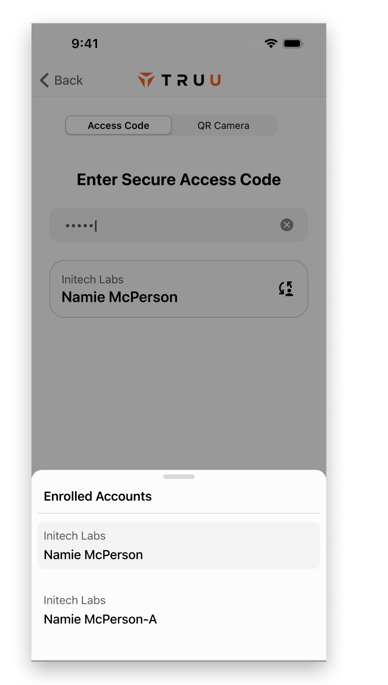
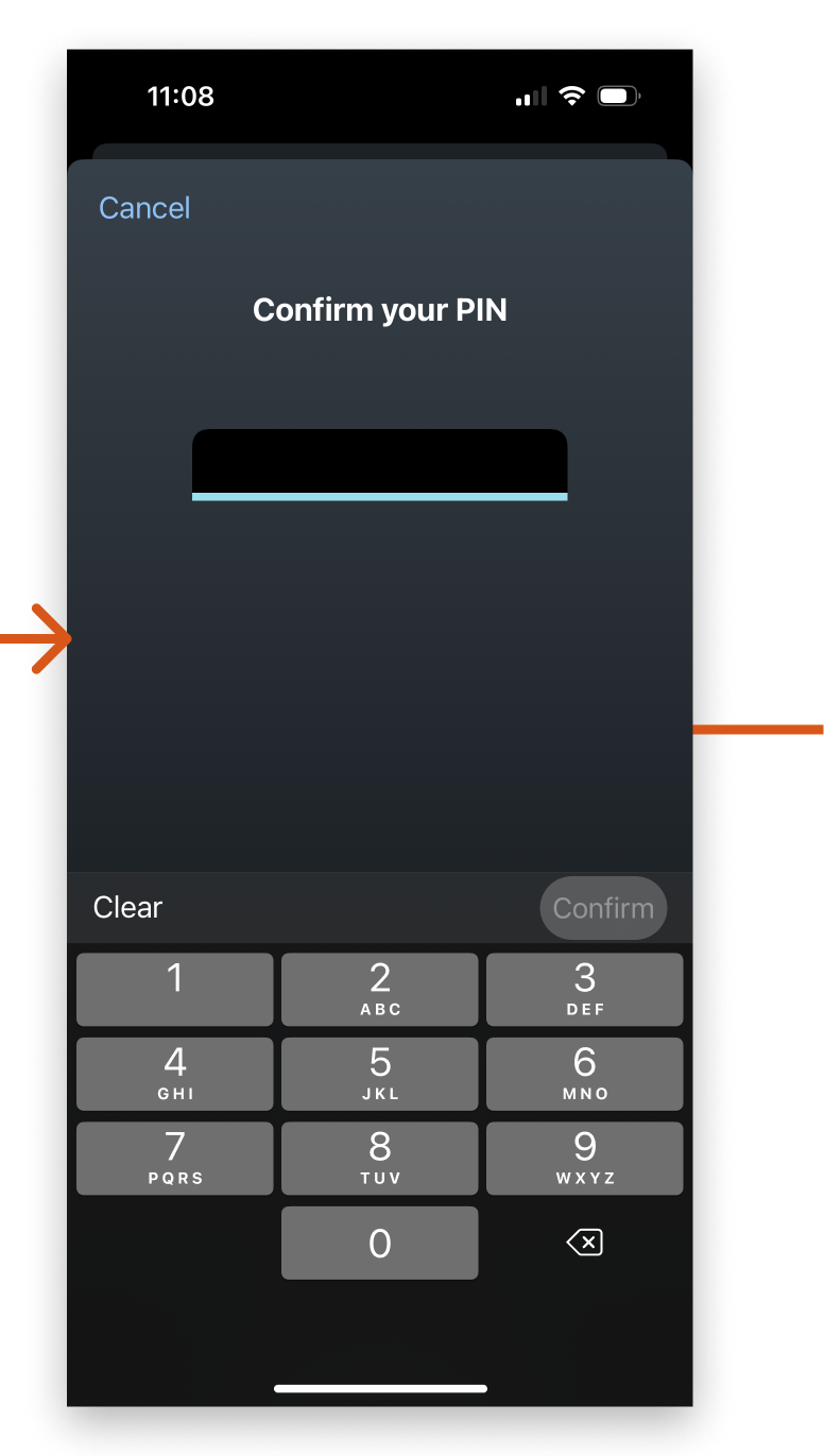
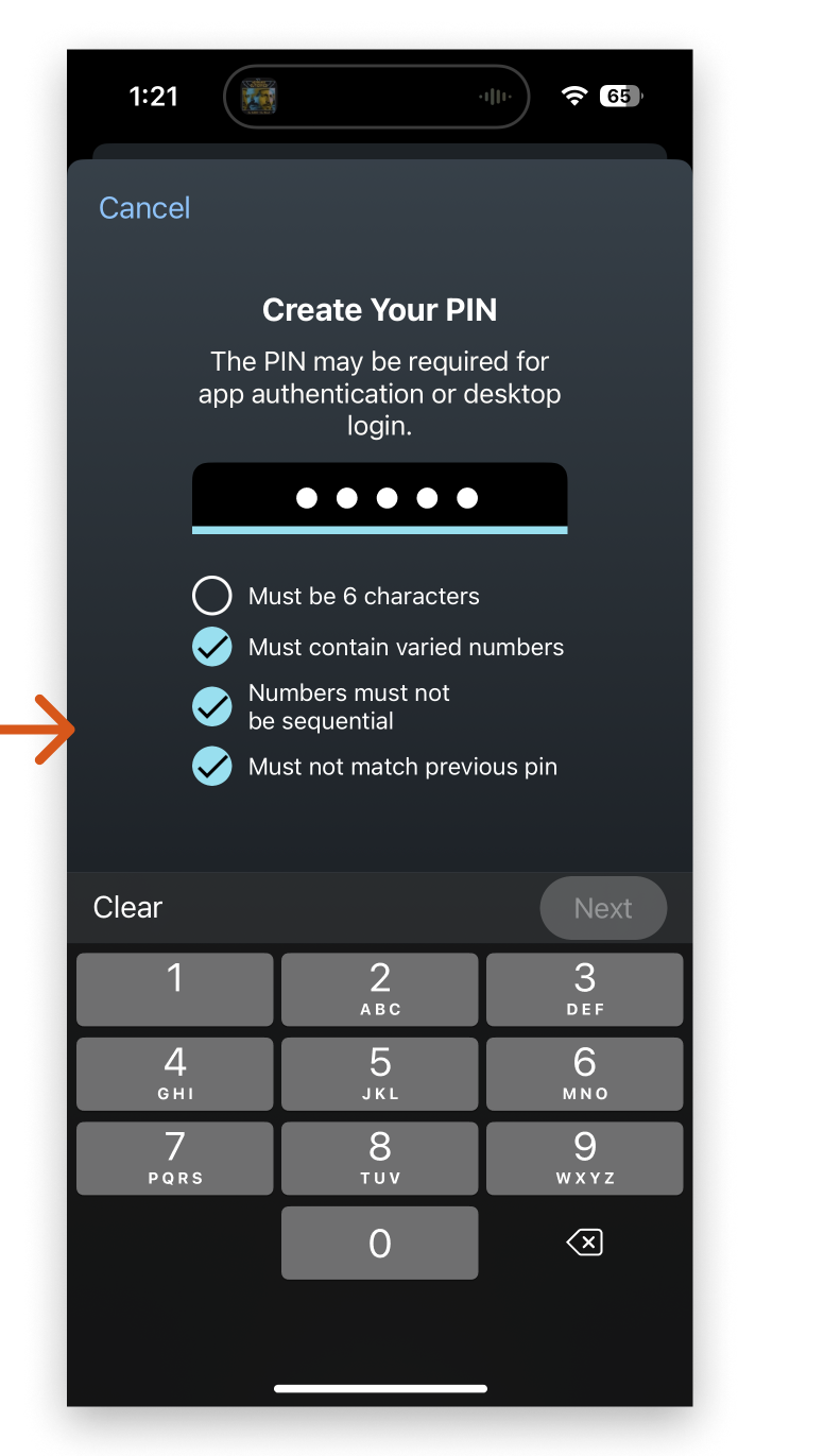
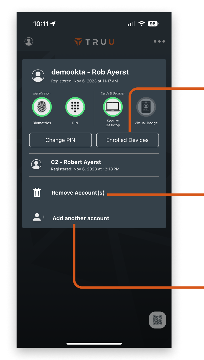
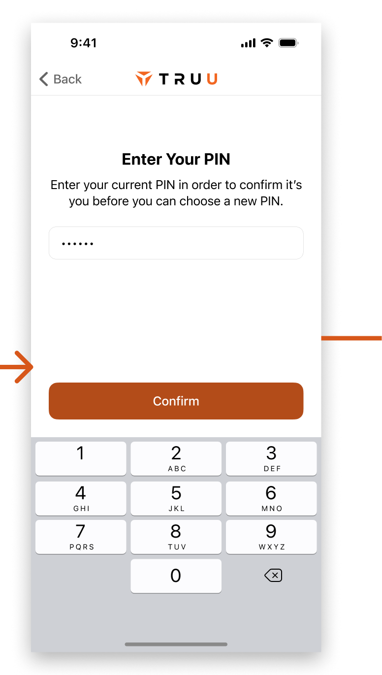
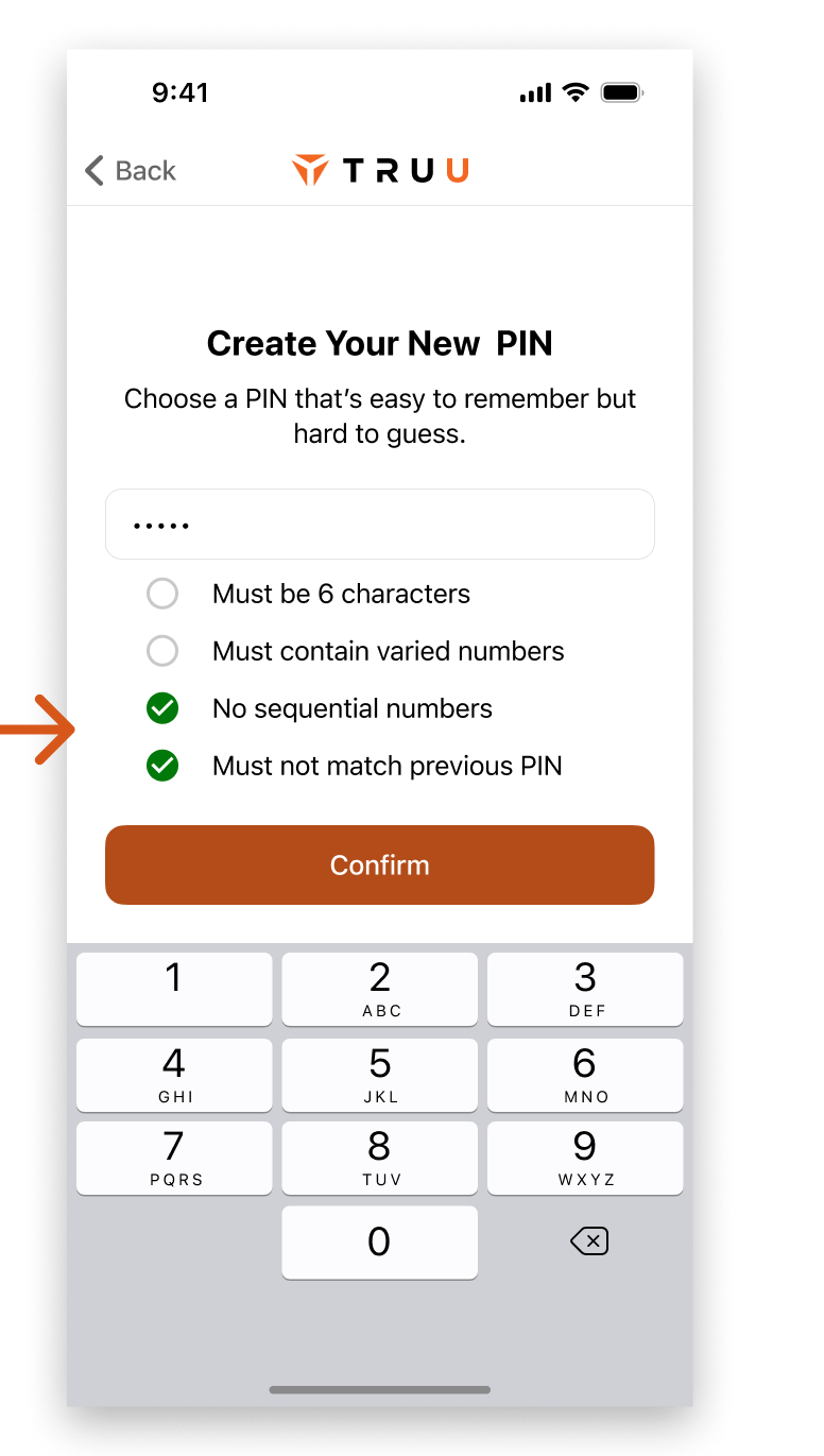
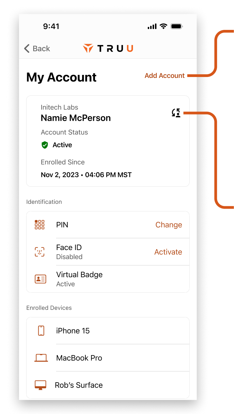
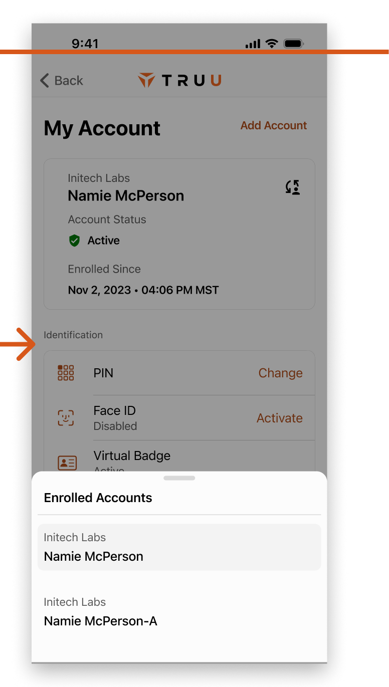
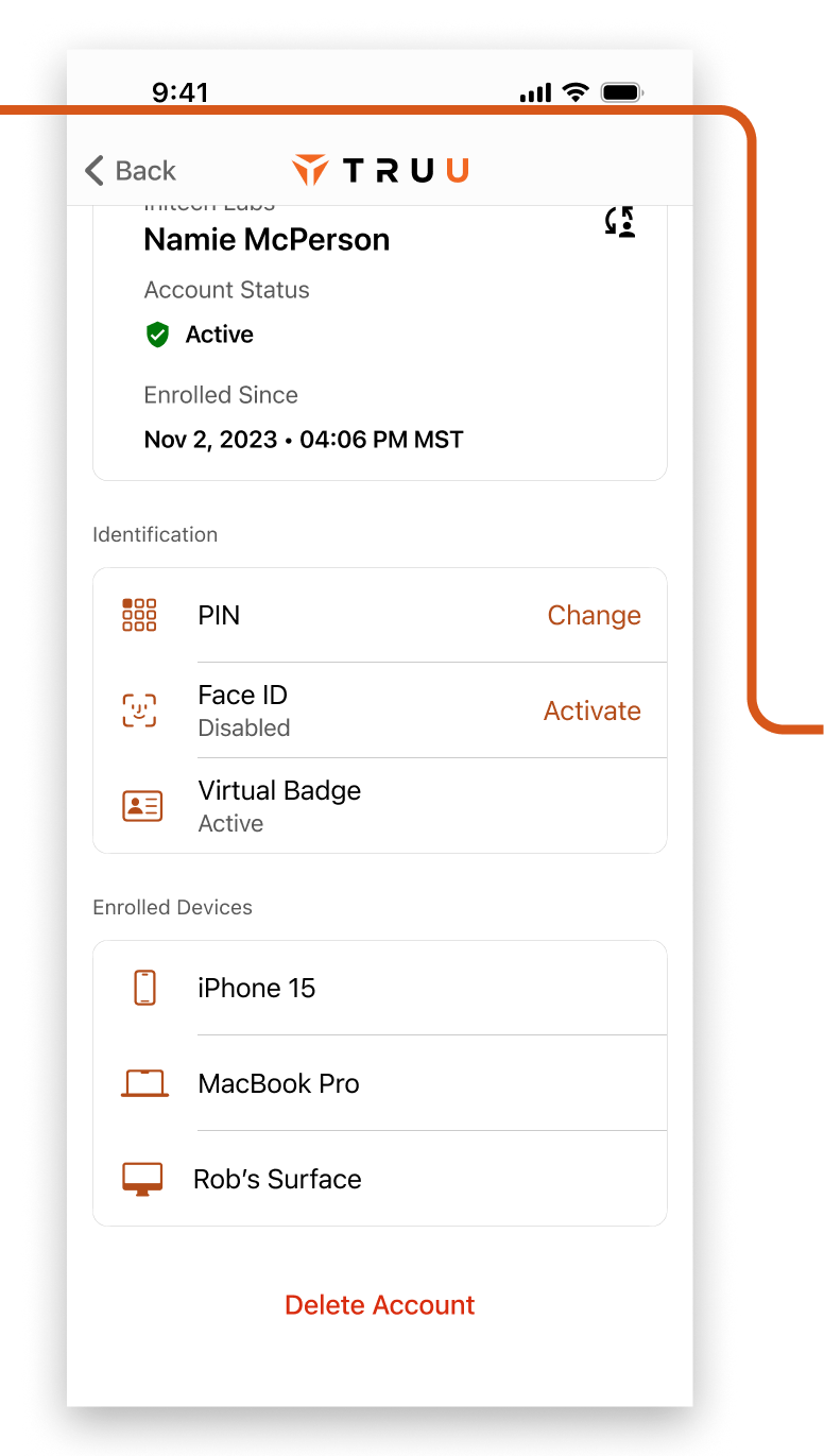
As you'll see in this project, Account and Settings in the app were very problematic. Nuances involving multi-account support with varying permissions required careful thinking.

Enrollment & Permissions

A mixture of UI styles collided along with some less-than-consistent handling of themes caused some strife between our users and our customer service team. It was vitally important to get the first taste of the app polished and professional. This ended up being a complex undertaking, and will be covered in a separate project.

Home and Authentication

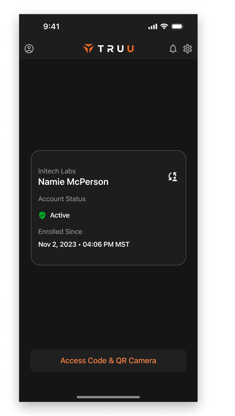
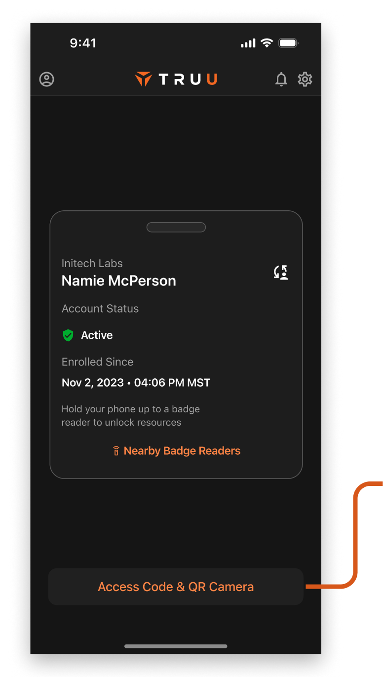
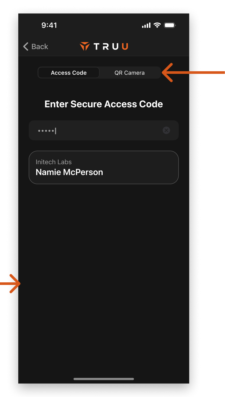
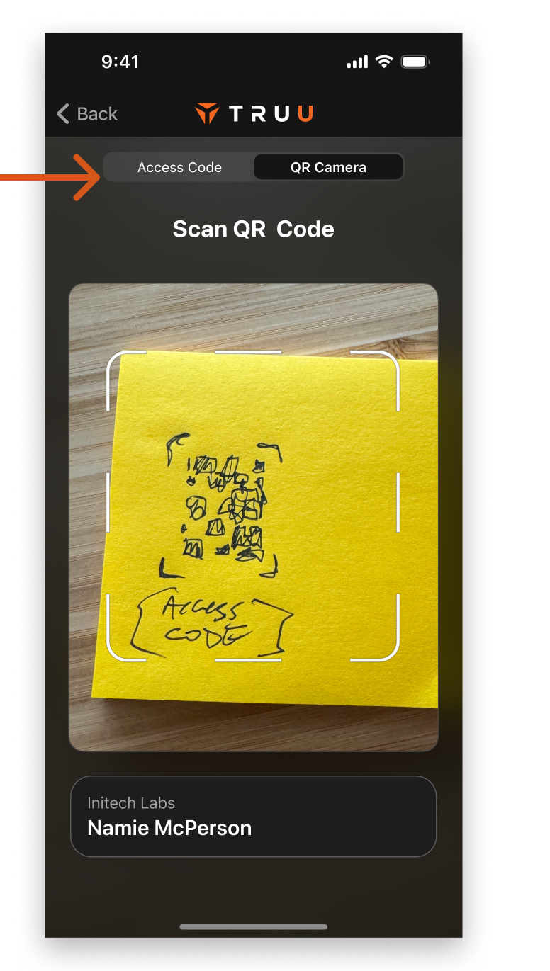
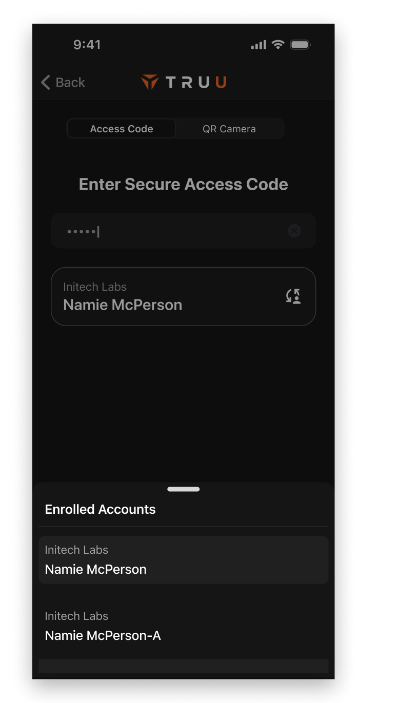
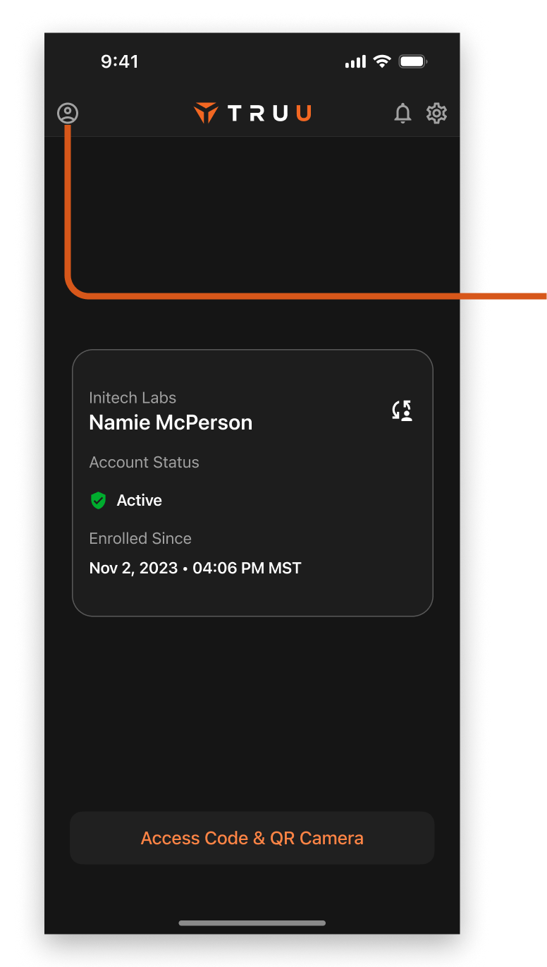
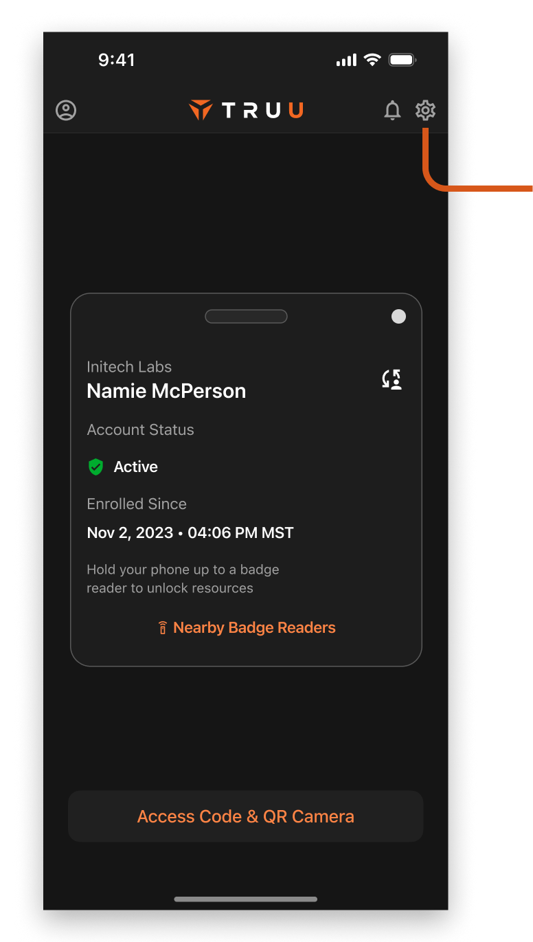
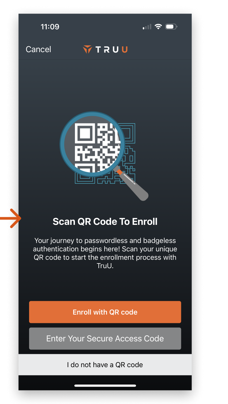
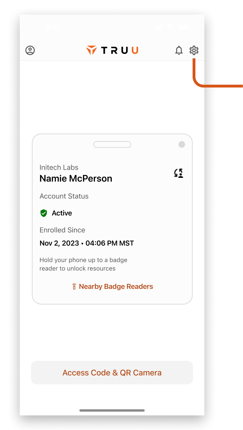
This is the bread and butter of the app. Almost anytime a person opens it, they're either following a deep link prompt, scanning a card reader, or using their authenticated account to scan a QR code / enter a Secure Access Code.

Home Page

This was the default state of the app. If physical card reader was activated for the account, an Access Badge shows up in the UI.
  • QR button at the bottom right wasn't obvious, especially for iOS users. If a person needed to enter a Secure Access Code, they would first have to know to open the QR scanner
  • If account required verification, it would show up a single time as an in-app notification and if dismissed, users wouldn't know why they couldn't authenticate (see the in-app notification in in the second screen)
  • Access badge had a swipe feature, but the swipe didn't achieve anything
  • The teal coffee cup and rocket ship bothered some clients and also didn't serve the TruU brand

QR Scanning and Access Code

The in-app camera for QR scanning and Access code was used to authenticate on a separate device using a TruU-enabled mobile app. This was a common use case for people opening the app.
  • There was a WCAG-failing "Scan QR Code" text at the top that was nearly invisible on light backgrounds (look closely to see it)
  • The "Enter Your Secure Access Code" button was not intuitive to users as a path to get to the access code entry - it looked more like instructions for how to use the QR scanner
  • The Secure Access Code entry area didn't support copy/paste

Multi-Account Authentication

Supporting Multi-Account was important, especially for IT admins who needed to juggle multiple accounts with various permissions to go about their jobs
  • When using QR or Access Code to authenticate, we prompted to select which account to point to each time. It was concluded that most users had a main - or default - account, and we should make using that more streamlined
  • On the Access Code screen, the stacking of system alerts looked problematic
  • Note - in these comps, the "Next" and "Previous" were both testing accounts I had loaded on my TruU App at the time

Push Notification Authentication

When authenticating a  app on a device with an active TruU authentication app, a deep link notification would direct the user to TruU, where they would be able to approve or reject the sign-in. Similar to how Google sometimes points users to YouTube as a 2FA method, but ours was dedicated to authentication and more secure.
  • The Account (in this case, Next) was too small and blended into the UI
  • The shadows behind the buttons gave the app a bit of a dated look
  • Not taking over the screen enabled a user to open QR scanner, account and settings, making hierarchy of actions scattered

Redesign of Home and Authentication

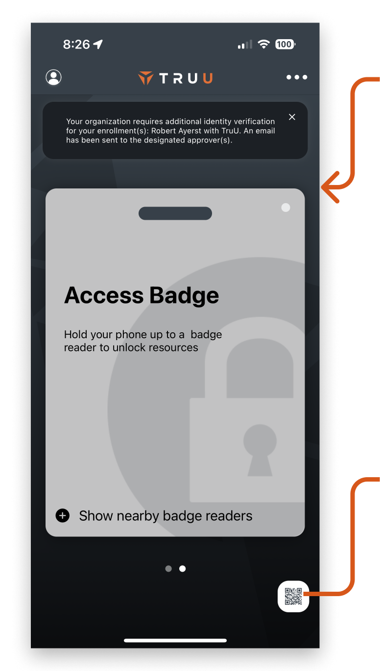
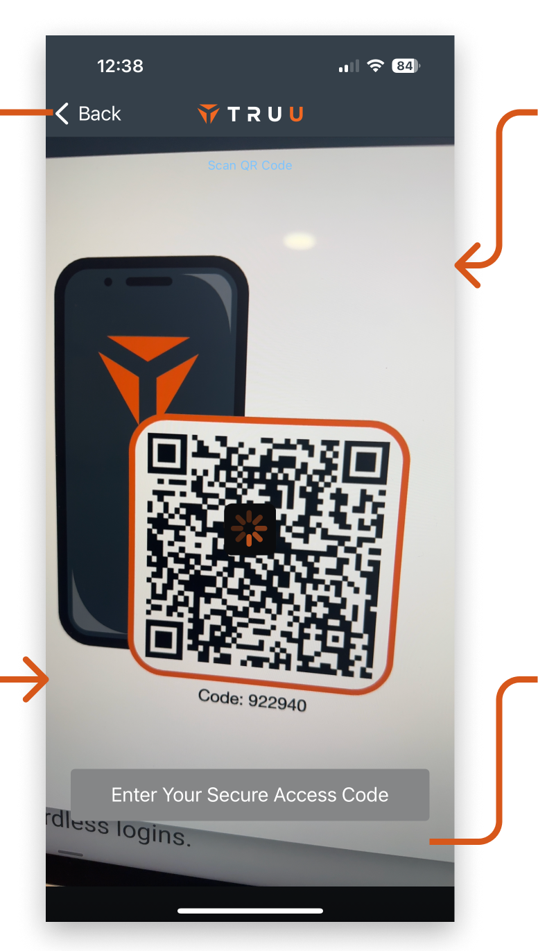
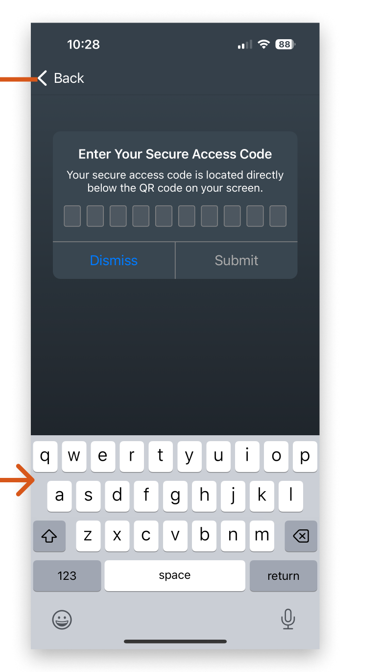
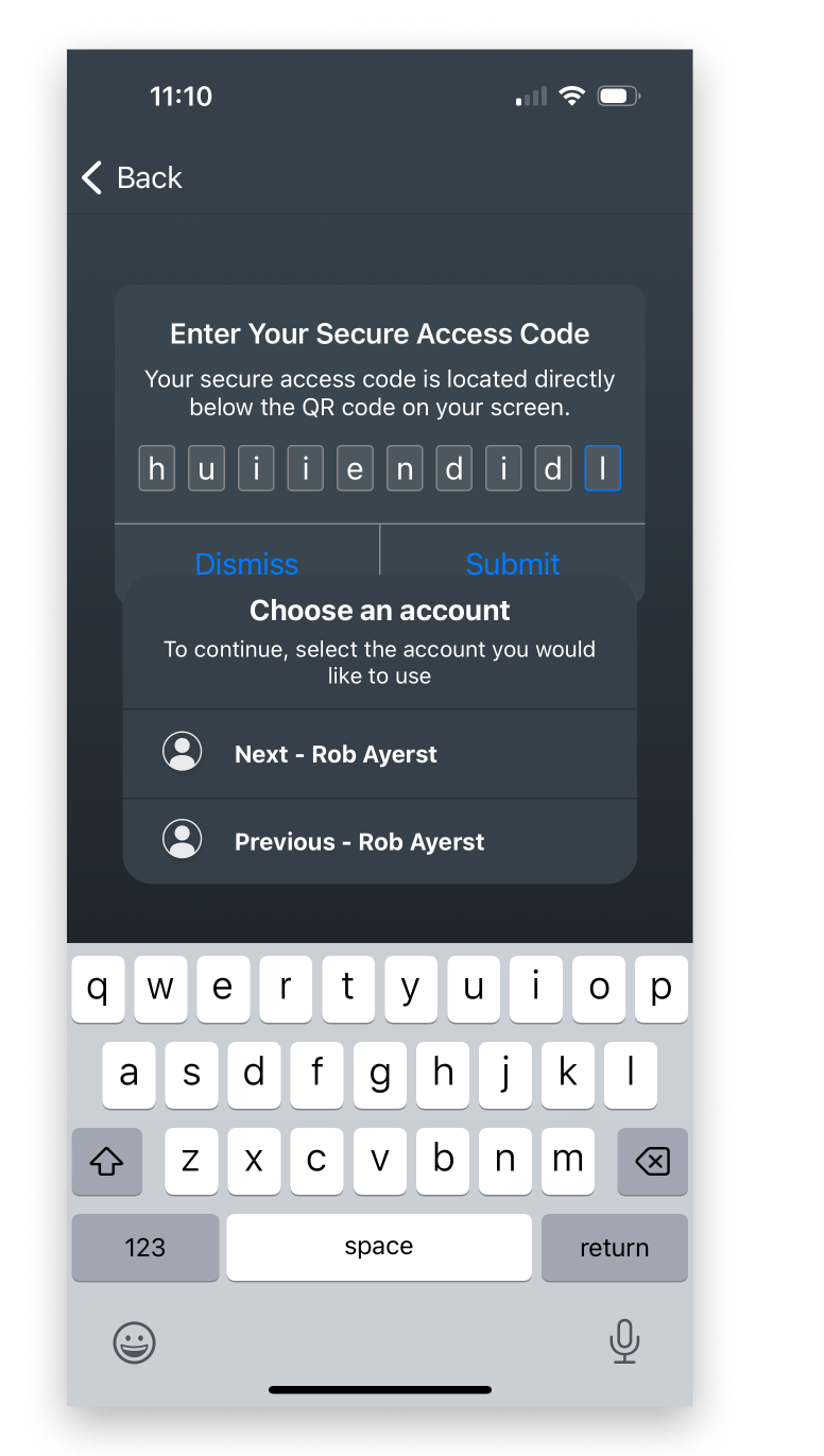
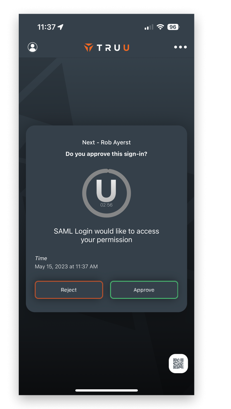
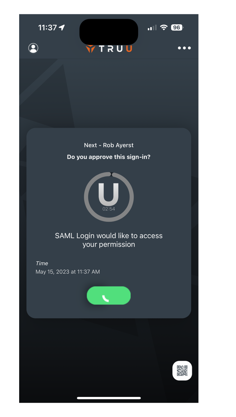
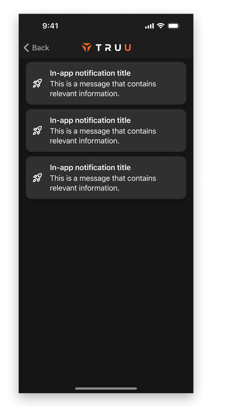
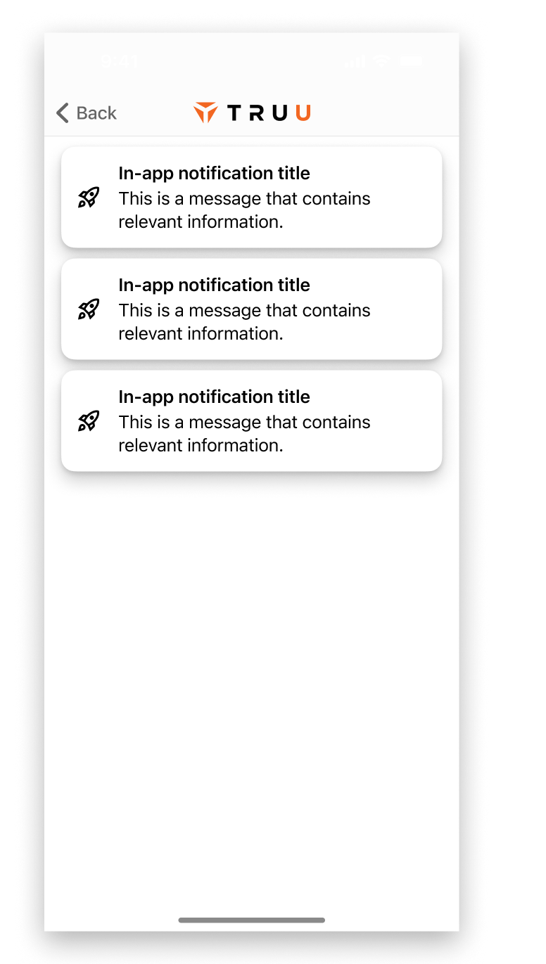
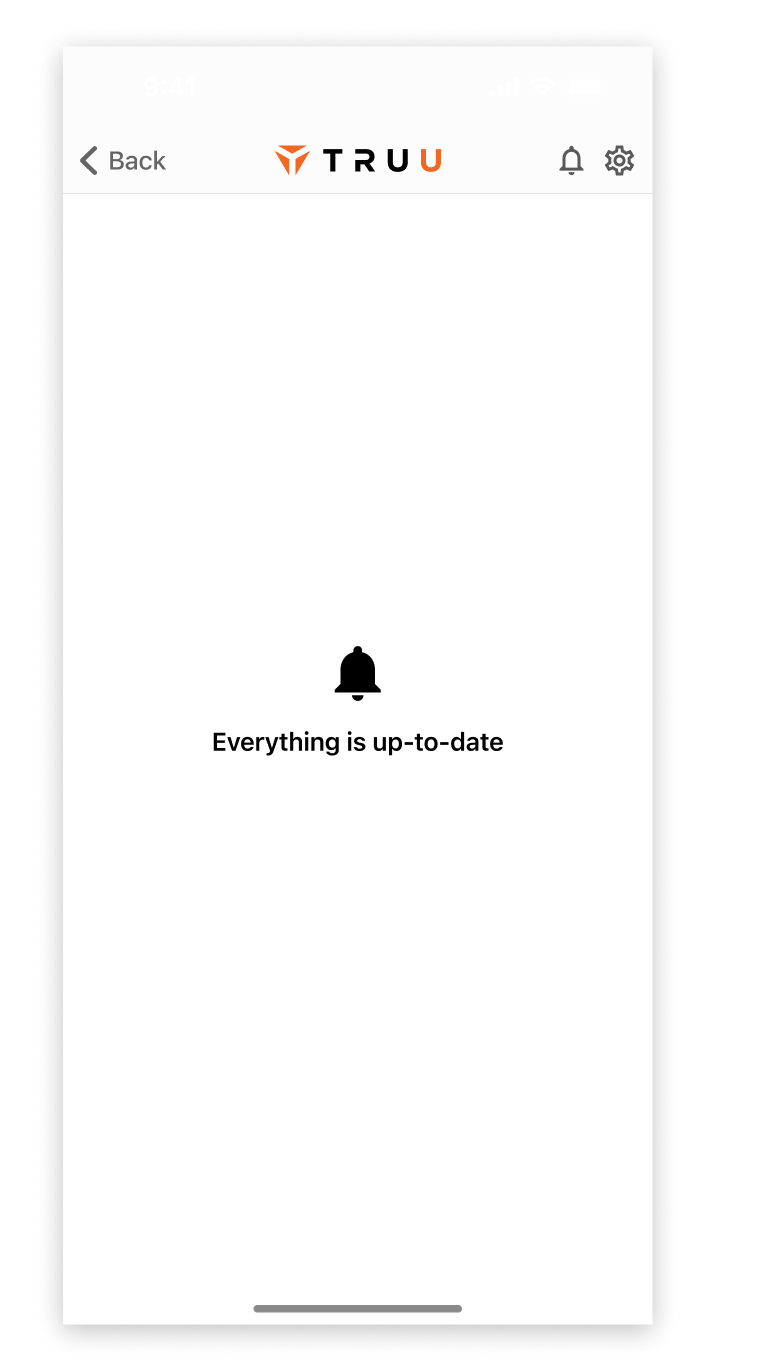
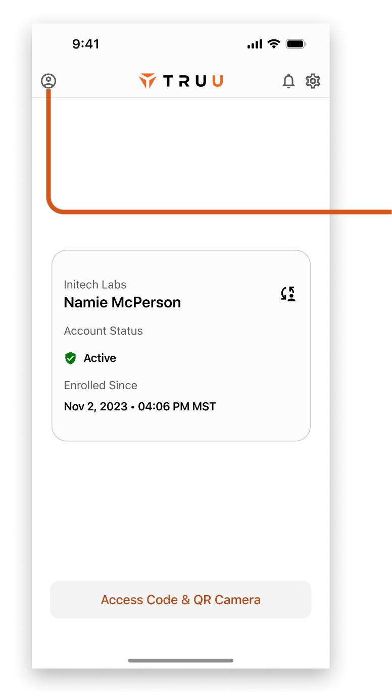
There was a lot of low hanging fruit available in redesigning the home and authentication screens. Besides getting light and dark themes online, we moved to more native styled UI components while elevating important information like the status of the account (previously a one time in-app notification) and the path to QR scanner and Secure Access Code.

Light
Dark

Home Screen

The most prominent changes to the content of the Home Screen is the inclusion of the active account along with some UI cleanup.
  • Account Status general information became permanent elements
  • A standard, labeled button replaced the QR icon at the bottom right
  • Settings entry was swapped from a "three dots" icon to a gear icon
  • In-app notifications were scrapped and replaced by a dedicated notifications area accessed from the top bar

QR Code and Access Code

QR Scanner and Access code would become more linked, and less sequential. Instead of launching the camera, the app would default to the Access Code entry with a segmented control to allow switching to the camera.
  • Default to Access Code in case a user doesn't want to give permissions for camera, we don't have to annoy them with permissions requests
  • Some A/B testing was needed to determine if the multi-account bottom sheet should dismiss when a different account was selected, or make the user manually dismiss it

Deep Link Auth and Multi Account

When a person uses a deep link to navigate to the TruU app, the following authentication isn't only the most important thing to do - it's the only thing.
  • Authentication became a full screen experience, so a user couldn't get lost in other actions until they approved or rejected the action
  • The hierarchy of the content was rethought to add a bit more information, and make the person's name, company, and tenant more obvious
  • Scan QR Code text was moved out of the main camera area and made more legible
  • The account being used would be shown to the user up front. If multiple accounts are on the device, there would be a method to switch accounts before authenticating

Notifications

While notifications weren't a predominant feature of the app, they needed a home. They were previously handled as dismissible toasts, and that caused layout issues in the UI as well as some development headaches with some brittle bits of custom code.
  • Notifications was moved to it's own section accessed by a bell icon in the top bar
  • Each notification would be stacked in its own card, and could be dismissed by the user
  • When no notifications were present, a blank screen would inform the user that everything was up to date

User Account

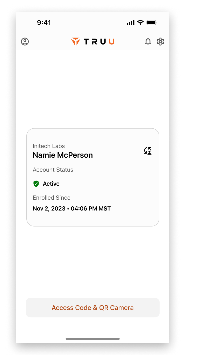
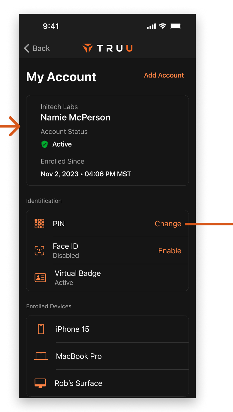
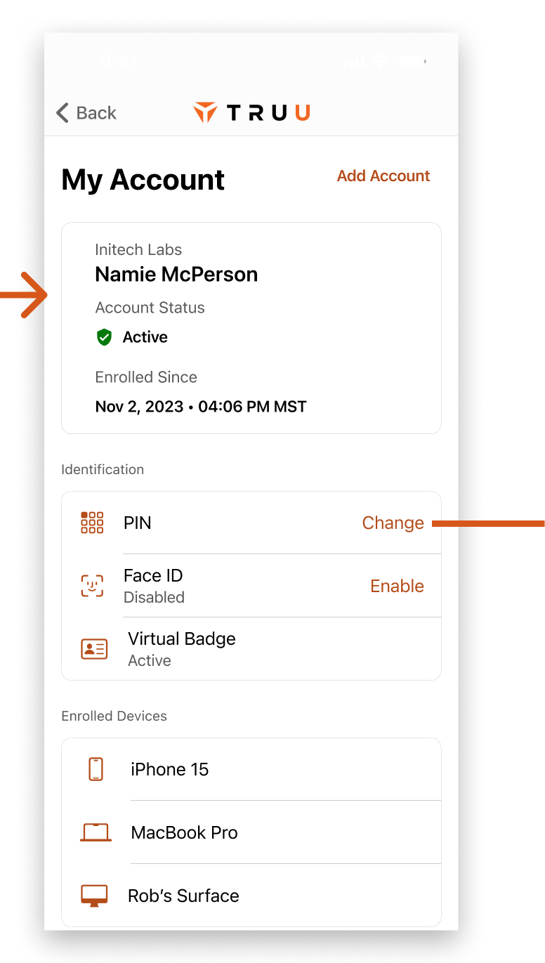
The user profile contained important information about the account including authentication methods, associated devices,  and other useful bits.

Accessing User Profile

Tapping the person in a circle icon in the top bar would open a modal with a few different actions and pieces of information. Android devices made it full width to accommodate tiny screen sizes.
  • Tapping the green-circled icons would expand a paragraph explaining what each one was, but wasn't obvious that a user could do so
  • Change PIN would open a modal, while enrolled devices would trigger a navigation push, while remove accounts would open a native-style alert - not a lot of consistency in interaction design
  • Secure Desktop tied to a deprecated feature and was still in the UI, but no longer needed

Change PIN

To change PIN, a user would first need to confirm their existing PIN. In these modals, the standard orange branding was scrapped in place of a cool blue. This caused some discrepancy in brand continuity.
  • After creating a PIN, a user could be shown the "Confirm your PIN" screen again to complete the process
  • The Confirm and Next buttons would turn sky-blue when a valid PIN was entered

Multi-Account User Profile

When multiple accounts are enrolled, an extra line would show up in the user profile. Here, you can see two accounts - "demookta" and "C2." Tapping on the C2 row under the Change PIN button would swap the top title for that account, and the Identification and Cards & Badges icons would change to reflect the status of the account.
  • Enrolled Devices opens up a new page with the associated devices to the account listed on the top of the modal (in this case, demookta)
  • Remove Account(s) would open an alert to remove one or multiple accounts simultaneously
  • Add another account would start the enrollment flow

Enrolled Devices and Enrollment Start

We see a slight theme change as we transition from gray background with teal and orange highlights on the home screen to full black with only orange highlights. For the Enrollment screen, we see the teal come back into play.
  • Paired Desktop Agents in the Enrolled Devices screen was a deprecated feature and no longer relevant, but still in the UI
  • The Enrolled Devices screen showed devices associated to a particular account, but didn't actually show the account in the UI - only in the modal on the previous screen
  • Add another account screen had three buttons with three text styles, the bottom button being full-width and not looking much like a button

Redesign of User Account

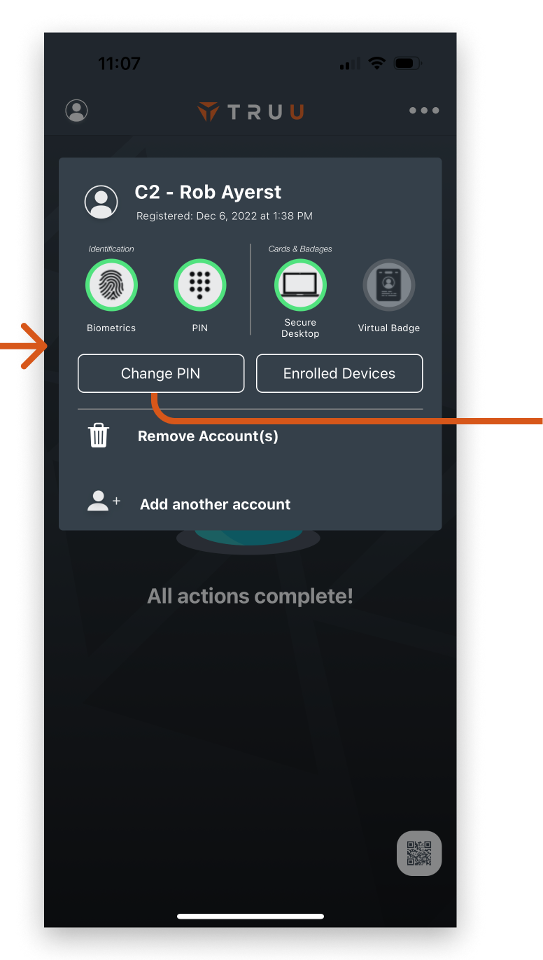
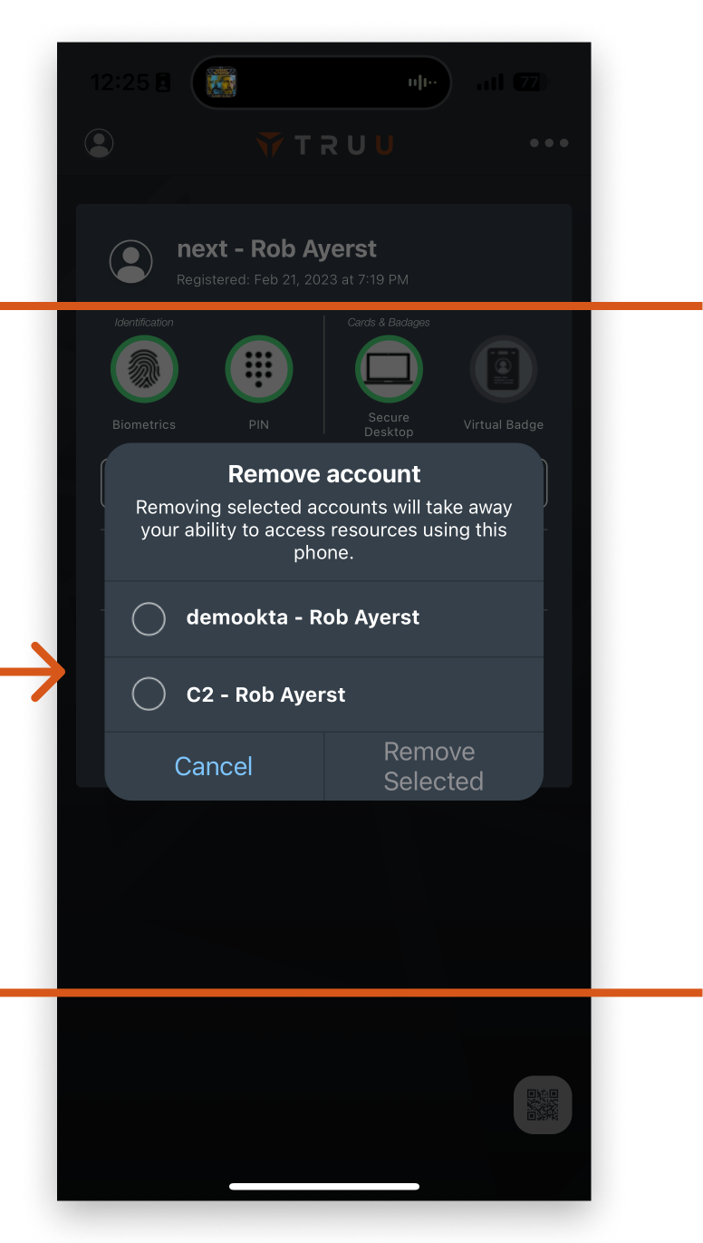
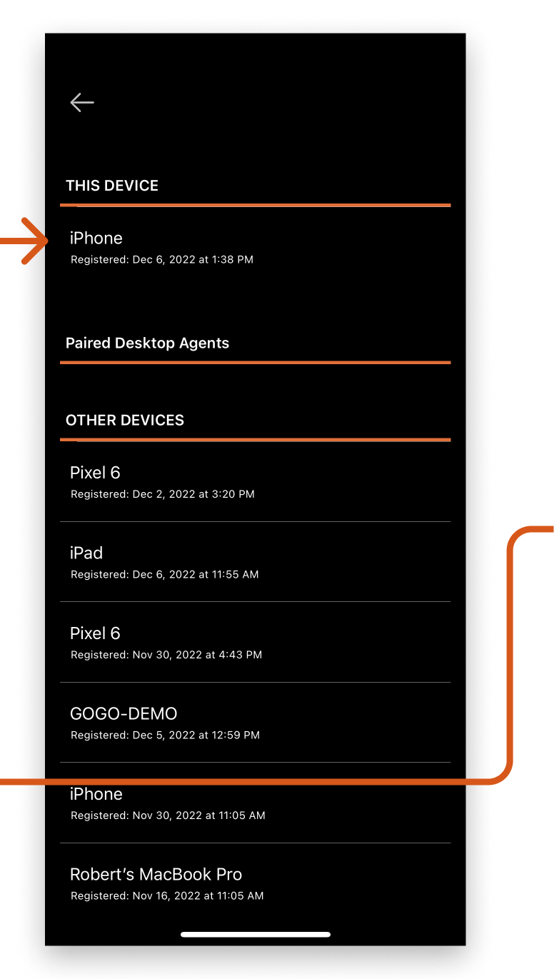
The user profile ended up being more complex than one might think, especially when considering that various accounts could have different permissions and capabilities. We started off by introducing light and dark themes and moving to more consistent UI styles, and also worked at fixing some UX issues.

Light
Dark

Accessing User Profile

We kept the person in a circle icon for the entry point, but promptly changed the style from a modal to a nav push to a new screen. This opened up much needed real estate to give space to the functionality.
  • Basic account information at the top for quick comprehension, with Add Account top right for easy access without taking too much space
  • Identification methods arranged vertically where a user could change PIN, and Enable biometrics which would open a native alert on the first try, and deep link to settings after it's been declined once
  • Enrolled devices was put in the scroll instead of living in its own section. Since the only thing to do there was to view devices and potentially delete one, a dedicated screen wasn't needed

Change PIN

PIN changing had its UI styles brought back to the brand orange, and a more iOS style text box was used instead of the Material 2 styled previously used.
  • We kept the pattern to conform the existing PIN to set a new one, but offered a little extra information to the user
  • Green check marks replaced the sky blue ones previously used. Green helped add some visual feedback that the correct thing was used compared to an off-brand blue
  • Similar to the previous flow, we'd show a second "Confirm PIN" after picking a new PIN

Multi Account for User Account

Since different accounts could have different permissions and capabilities, it was mandatory to split them out and offer a method to switch.
  • When multiple accounts are available, a switch account icon would show up next to the current account information
  • When selected, a bottom sheet containing the various accounts would pop up. Users could pick one, and it would update the screen with the newly selected account and associated details

Delete and Enroll new account

To delete an account, we put a button at the bottom of the scroll. This way, a user couldn't delete multiple accounts at once. Since that wasn't a typical use case, deleting only the selected account made sense.
  • Scroll down to find Delete Account. Switch accounts with the switcher bottom sheet to delete a different account
  • The Enroll with TruU screen was greatly simplified. Instead of having a confusing set of three buttons, we offered a text box to start, along with the option to open the QR scanner in the case that a user had been provided with a QR code

Settings

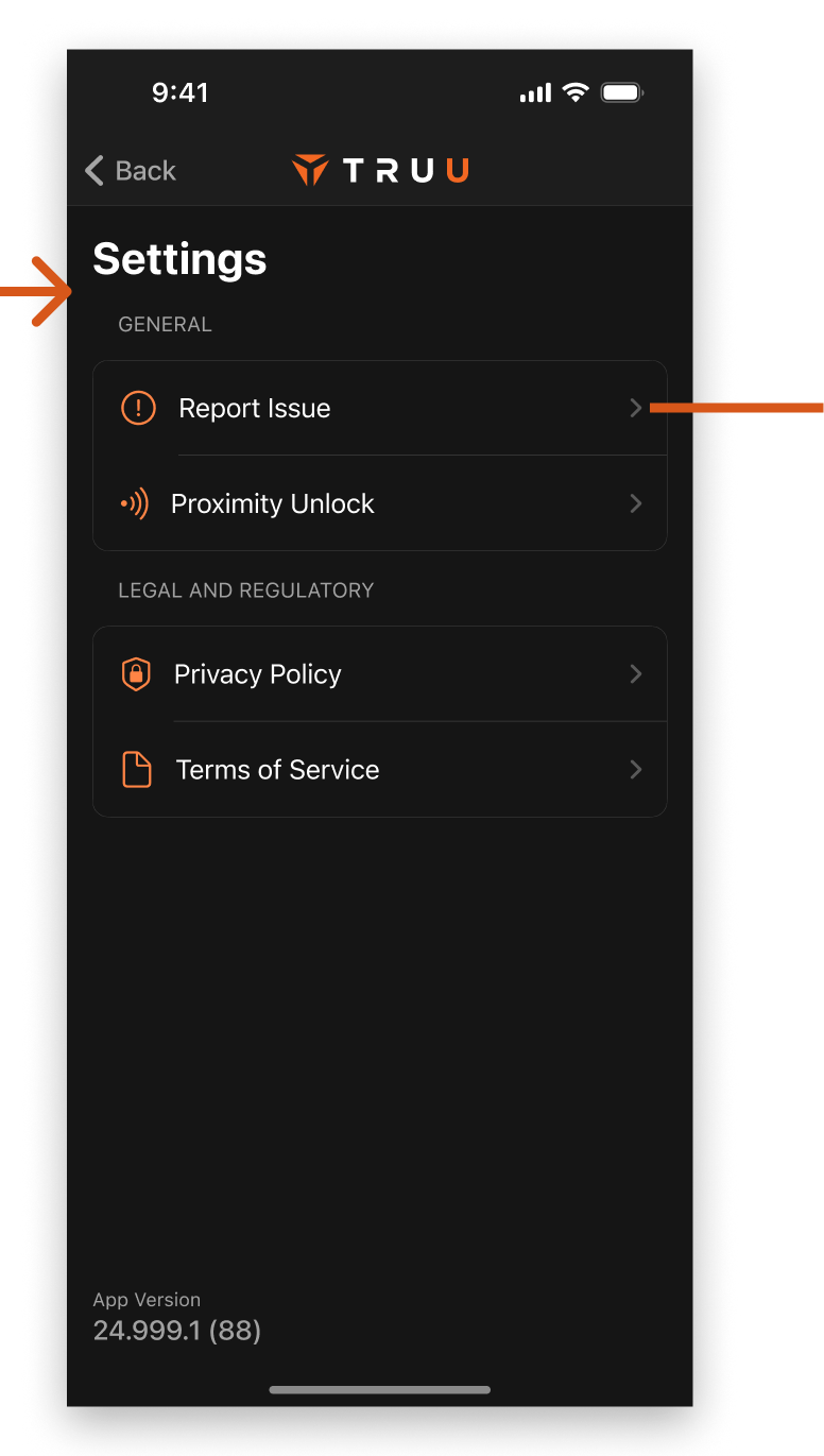
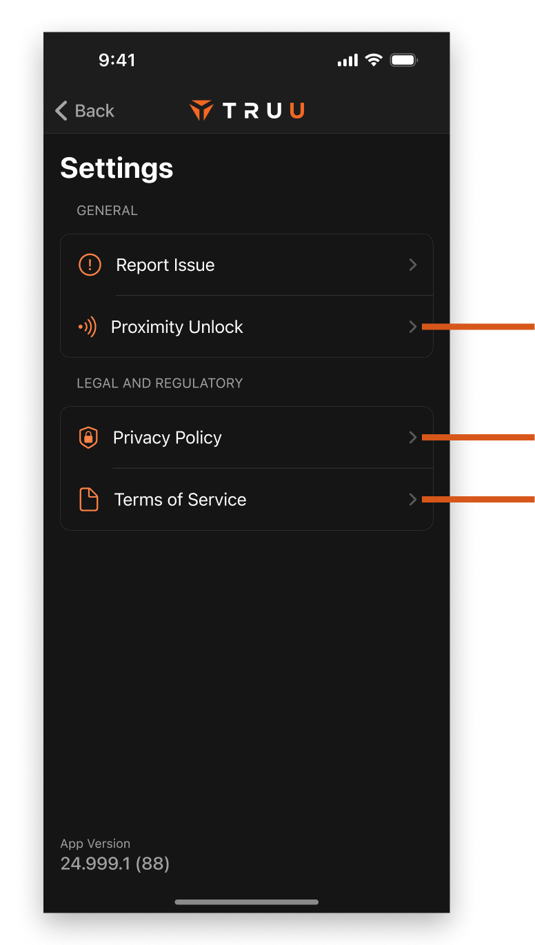
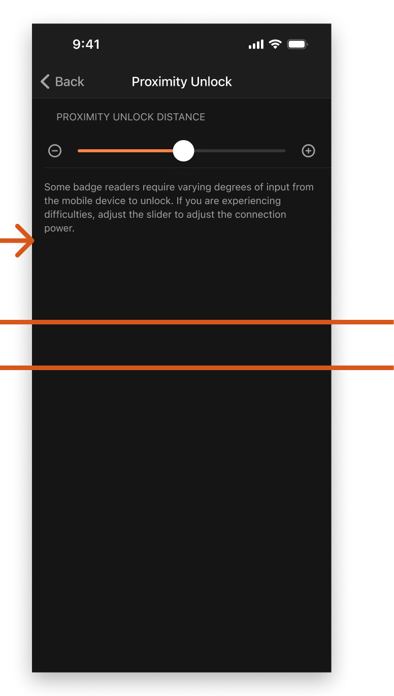
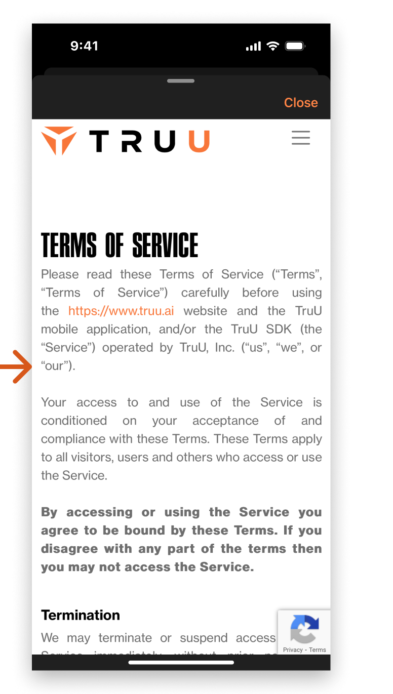
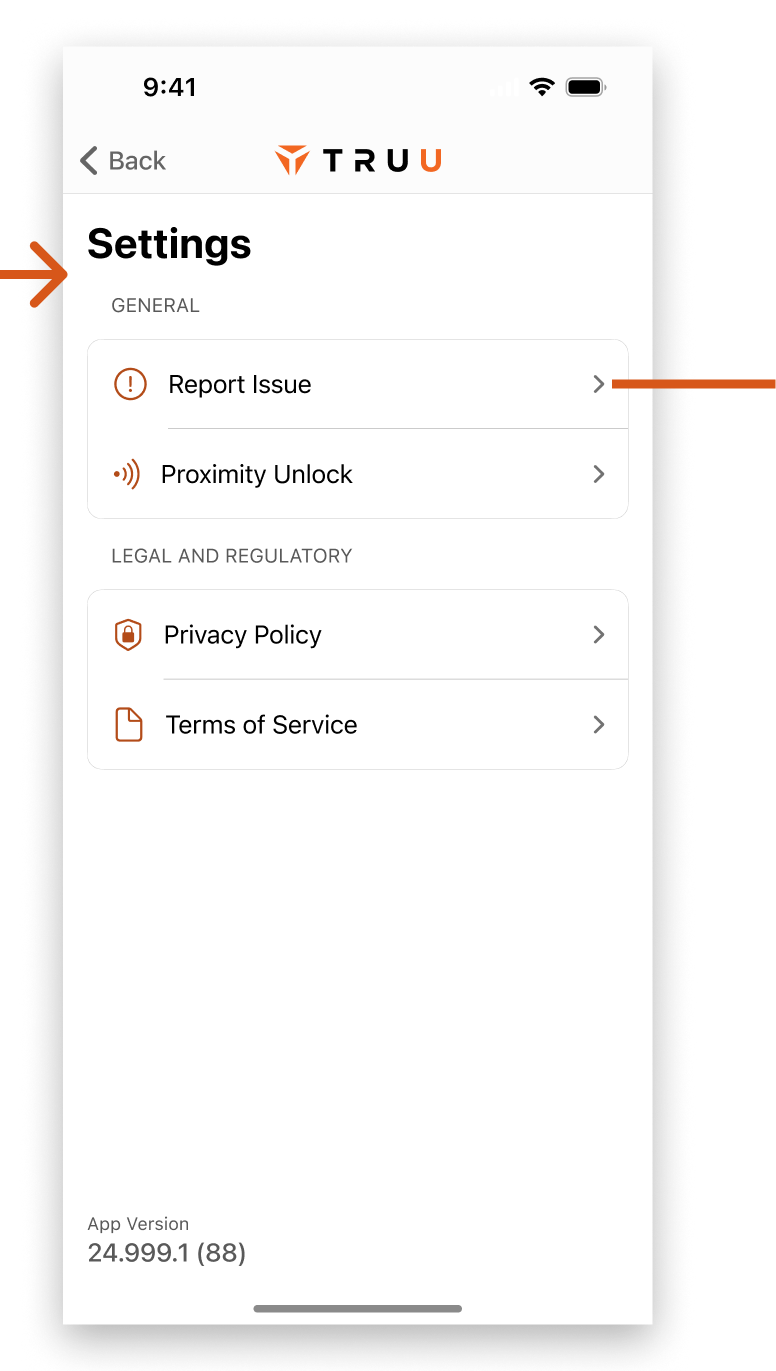
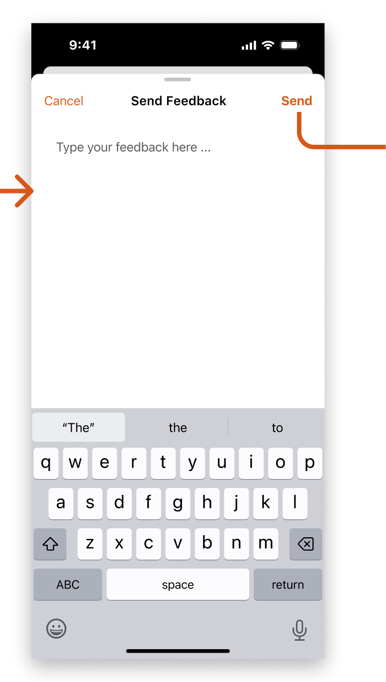
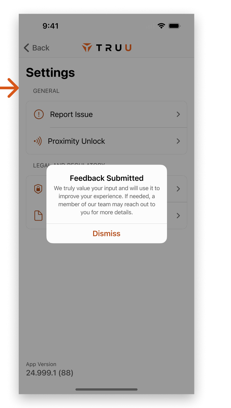
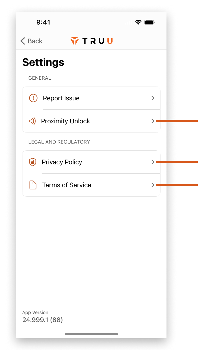
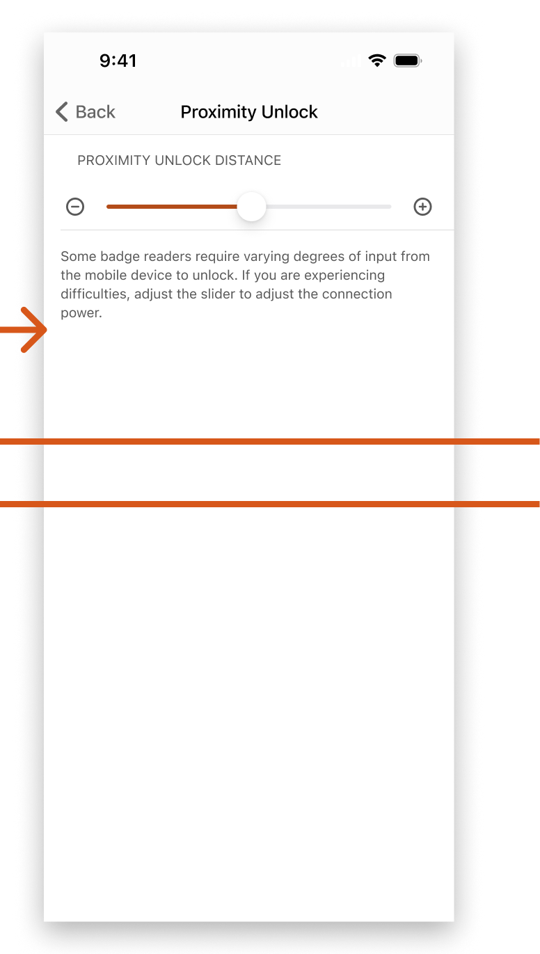
Settings was pretty thin, as there weren't many things to set. We almost put all these options in the User Account area, but we already had the page established and that would have widened the scope of the work. We focused on improving UI, with a plan to come back and rethink some UX efforts.

Getting to Settings

Right away, you'll notice that the entry to settings is a little funny. A three dot icon would open a menu containing a single option - Settings. This was leftover from when that menu also contained "Send Feedback" and some dev tools. It was never updated.
  • Tapping the three dots in the top bar would gray out the rest of the screen, and give the option to open settings
  • The Privacy Policy and Terms of Service text were both buttons, and would open a web view if tapped

Sending Feedback

Unfortunately, the send feedback UI relied on a native alert with a single line to enter comments. This caused obvious usability issues as a person couldn't see their whole comment and it was difficult to edit.
  • Pressing send would open a native share bottom sheet (Activity View in SwiftUI). Users were expected to bypass the main share options, and select a "Share with TruU" option after scrolling
  • Sharing with TruU would open an email modal, and the user could then see their typed message along with the never-before mentioned logs which were attached
  • User could delete or alter the message before sending

Proximity Unlock

The proximity unlock area was fairly straightforward. It used some off-brand colors which didn't serve the continuity of the app, but was otherwise fairly usable.
  • There was a proximity unlock option that would allow a user to adjust the bluetooth power for physical badge readers. The version text had identical styling to the links around it, which caused some confusion

Privacy Policy and Terms of Service

If a user discovered these options were clickable buttons in settings, it would open a web view linked to our site - or a customer's chosen domain if they wanted to link to their own policies.

Redesign of Settings

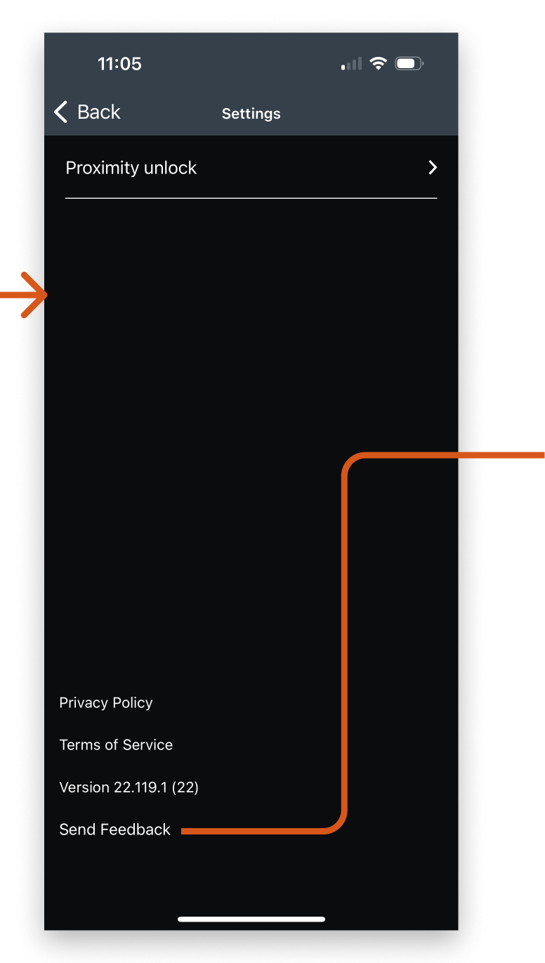
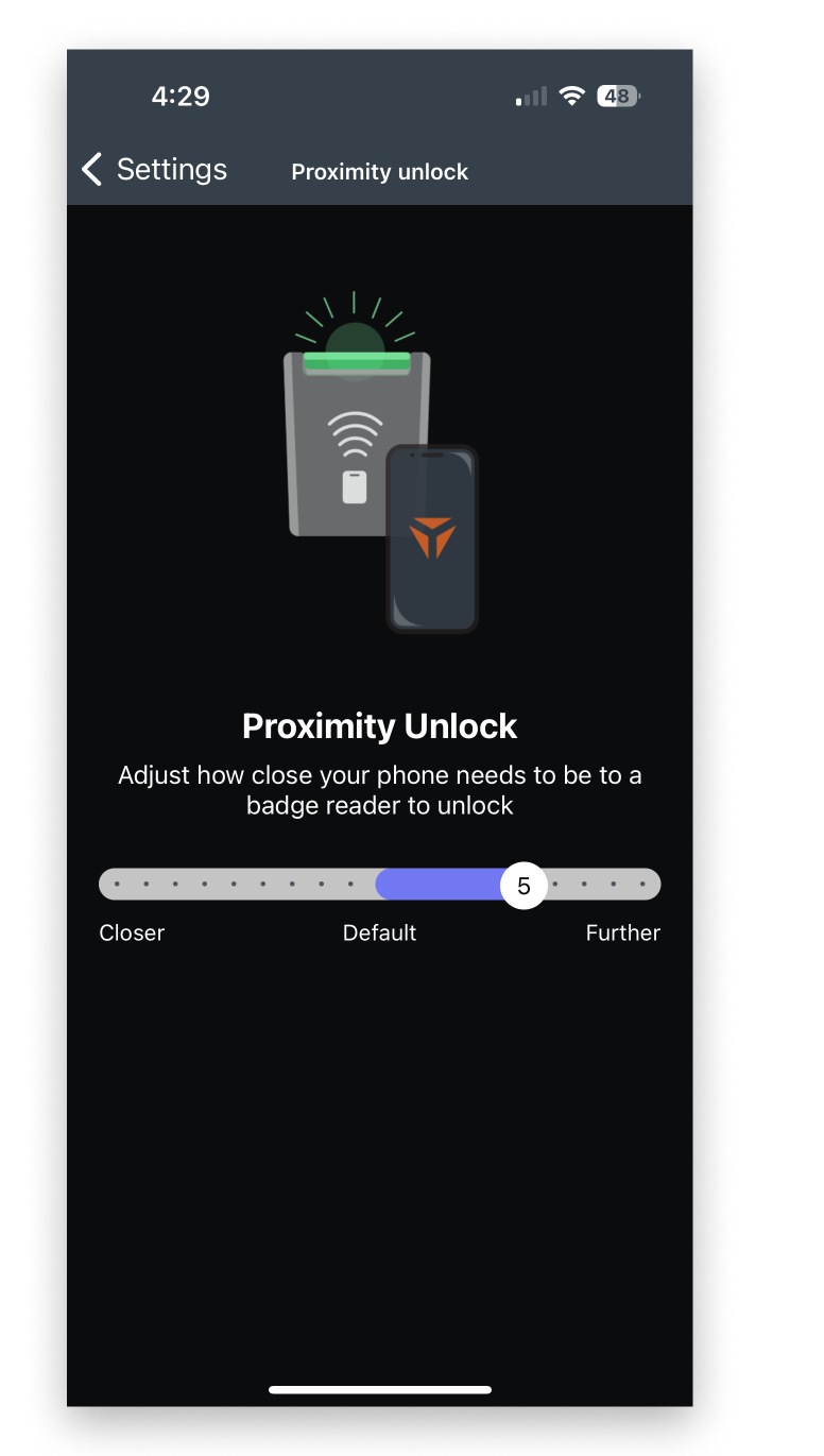
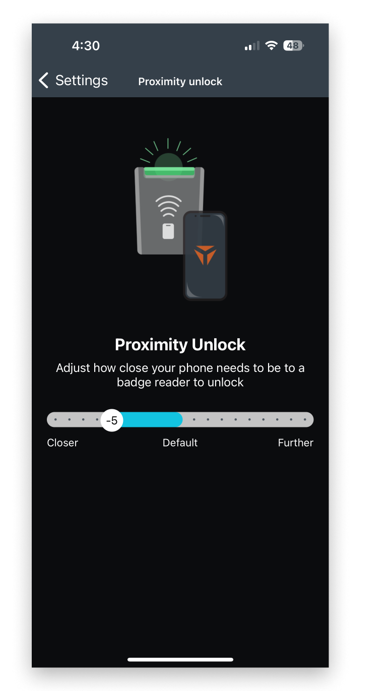
Without increasing scope in settings to the point of rearchitecting the app, there were still a fair amount of UI improvements to be done. As with the rest of the app, we moved to a light and dark theme approach and used more system style UI components

Light
Dark

Getting to Settings

First thing was to scrap the three dots icon and replace it with the standard gear icon in the top bar to get to settings.
  • Settings screen saw all the user-interactable options consolidated to a standard UI style
  • App version was kept at the bottom of the screen, as it was low in the hierarchy of things a user would do in Settings

Sending Feedback

We opened up real estate for Send Feedback by using a sheet style for the UI. This allowed users to see the whole message they wrote.
  • User was no longer constrained by a one-line native alert to enter messages
  • Sending no longer used the share sheet, and directly submitted the user's message and associated logs to the admin console. This would would typically spawn a Jira ticket depending on how the client had their system configured

Proximity Unlock

There wasn't a ton to do for proximity unlock besides switching the color styles out to be brand - no more blue and purple. We included a little more information to the user on what the proximity slider actually accomplished and simplified the screen by dropping the illustration, but didn't change anything from a UX perspective.

Privacy Policy and Terms of Service

Since the Privacy Policy and Terms of Service pointed to a url and used a web view to display, there wasn't a huge amount to do here. We switched it to a sheet style instead of a nav push to try to make it understandable that a user is viewing the company's policy and not something baked into the app. We also  did some subtle work to include light and dark themes.

Outcomes

We changed everything in the iOS mobile app from bottom to top. The response from internal stakeholders along with shareholders and customers could not be overstated - it was massively helpful to the business. At the time of launching the refresh, we were being scrutinized for not getting enough UX and UI improvements in any of the products. The iOS redesign saved the day, emphatically showcasing TruU's commitment to building a world-class app that could be used by all types of people.

Next Steps

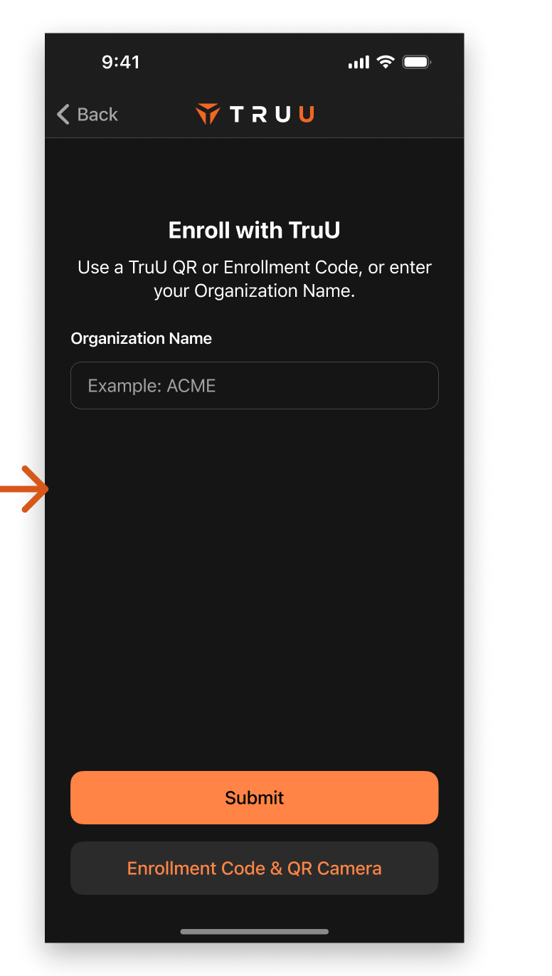
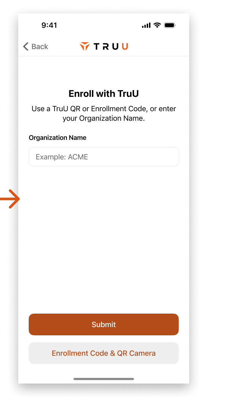
Some experimentation for multi account flows was much needed. All of this work was great and improved large swaths of UX areas, but it wasn't fully tested while we were building. Startup life.

  • Should we dismiss the account picker bottom sheet when a user selects an account, or leave it up as visual feedback of their selection? 
  • Sending feedback will go to different end points depending on the selected account. Should we be more obvious with the active account somewhere in the send feedback flow, or prompt the user to select the intended account before sending?
Back to Top
Projects