
TDOG Design System
TDOG
Design
System
Company
TruU, Inc
Platforms
macOS, iOS, Android, Windows
Tools
Figma
Date
Summer 2023
My Role
Creative Direction, Figma Component Libraries, Variable Color Systems
Scroll Down to View
TruU, Inc
macOS, iOS, Android, Windows
Figma
Summer 2023
Creative Direction, Figma Component Libraries, Variable Color Systems
When starting to build this system, I put a bit of thought into the name. The flagship product for the startup was an Machine Learning service that learned subtle mouse and typing patterns to their uses, and used it as a replacement for two factor authentication while keeping a constant awareness of who was using the computer. It was a very cool concept. It was named TCAT = TruU Continuous Authenticated Trust. I thought it would be a fun play on words to counter TCAT with TDOG - and the TruU Design Organization Guidelines were born.
Design systems are powerful tools and when implemented properly can help designers and developers approach software with enhanced communication, reduce repetitive decision making, boost efficiency, and help consistency for UI. Every organization will approach design systems with a differing strategy. Lots of factors will influence what the "right" method should be. How many teams are there, how large are the teams, what is the budget, the maturity of the product, propensity for teams to use new tools, and what system is currently in place just to name a few. This project dives into how I sized up the needs of a 5 year old startup, and produced new system that fit it perfectly.
The most simple form. Essentially a file with components built in it that can be copy and pasted. Can be used for student projects and quick ideation.
Central file that other design files can be linked to. Changes to the library reflect in design files. Perfect for solo designers and small teams.
Component library, but colors are linked to a style that's specific to how it works in products. Great for organizations who are interested in custom branding and light/dark themes.
A fully baked shared library, usually with semantic naming and a matching code base that's custom for each client. Usually used at enterprise level companies like Google, Apple, etc.
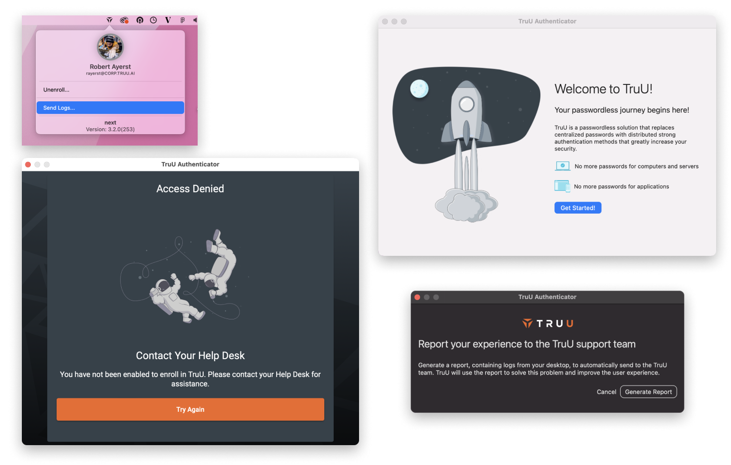
Originally hired to build and lead a team, but then our budget shifted. I found myself as a sole designer supporting 5 dev teams, all needing standardization of UI and full redesigns. This drove the necessity to have a nimble design system that would not only help developers work more efficiently but also help me juggle all the various constraints while I worked towards a redesign. Additionally, we had a medium-term goal to support custom branding - so everything needed to help move us towards that. Here were some of my initial thoughts.
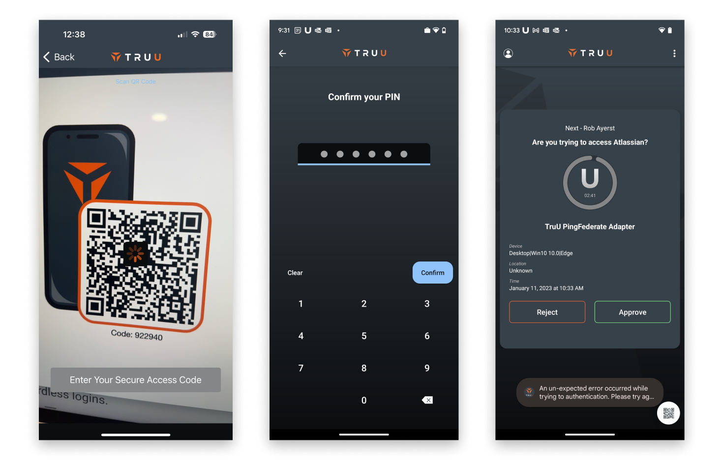
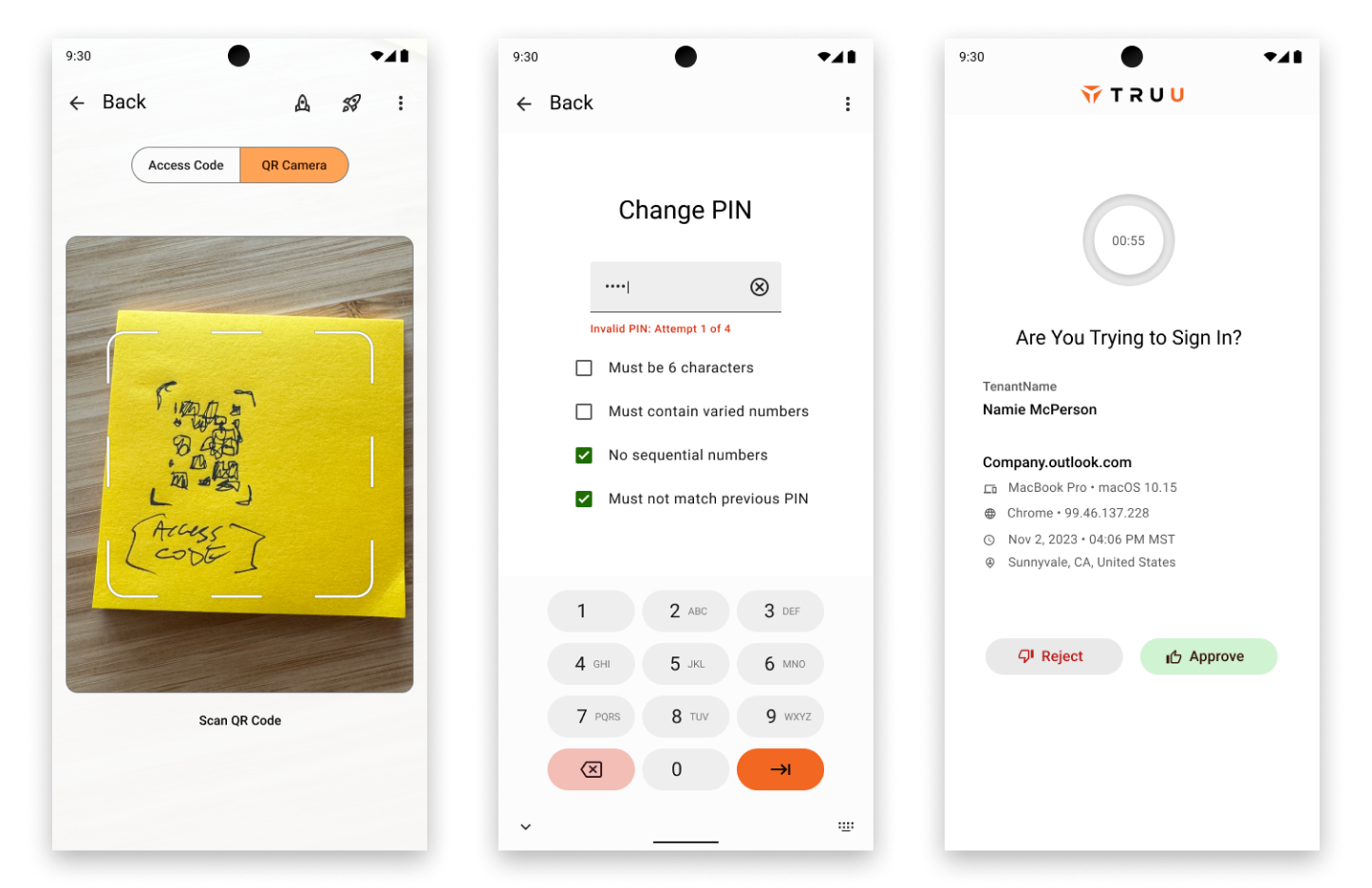
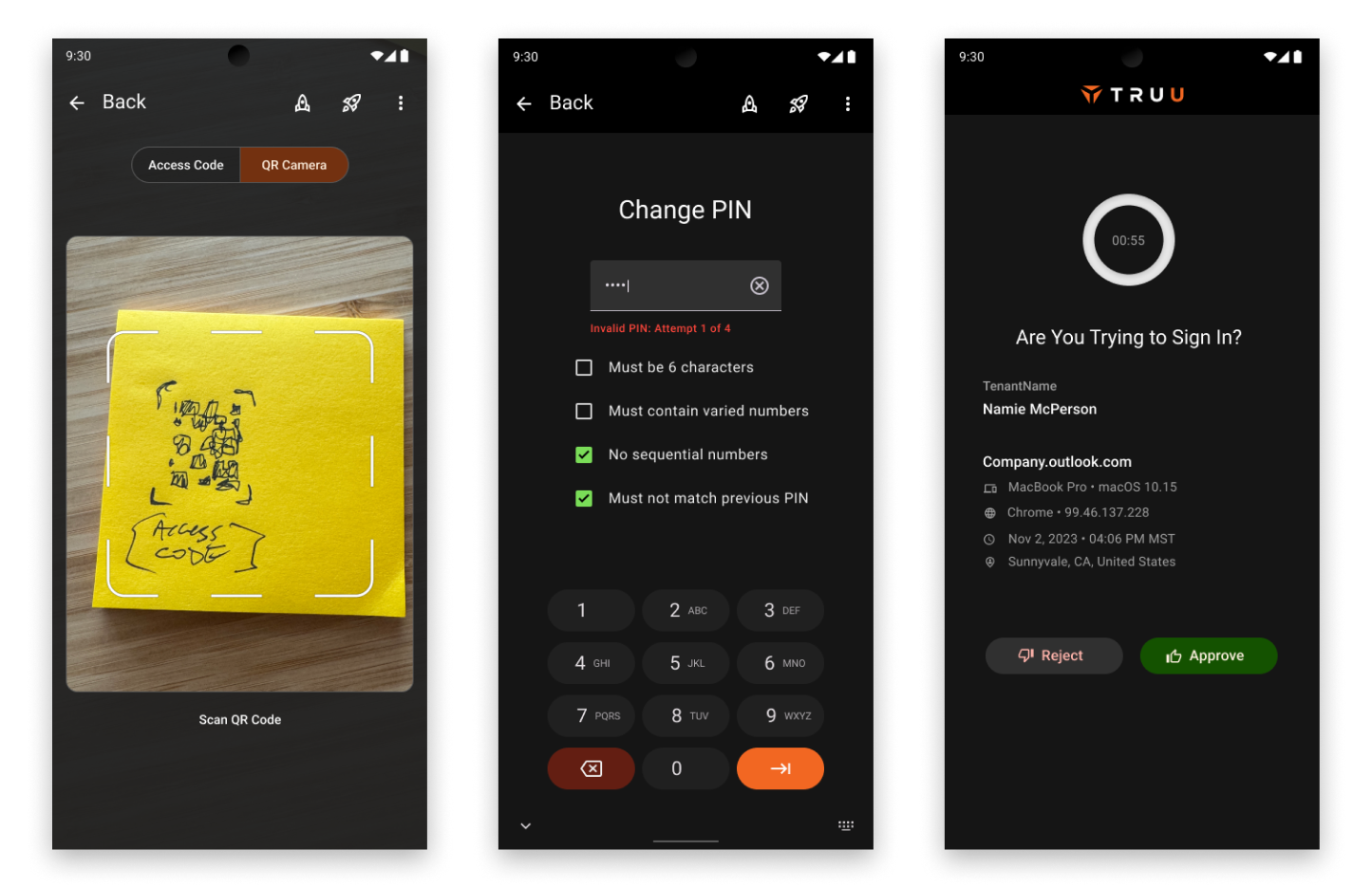
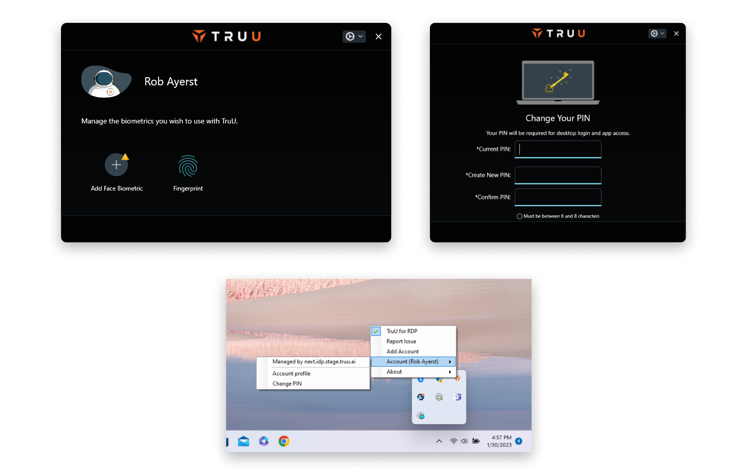
The product I was designing for was a cybersecurity utility. Our competitive advantage was the lack of touch points for users to interact with. We replaced the login UI with our own, and used our UI for authentication into apps and services. Mimicking the design patterns of the platform we were operating on would make the experience less obtrusive.
There is certainly a time and place for custom building everything in a UI to drive home a branded look, but that wasn't on the table here. After conversations with all the dev team leads, we decided that we wanted to lean towards using the system components that "come for free" whenever possible.
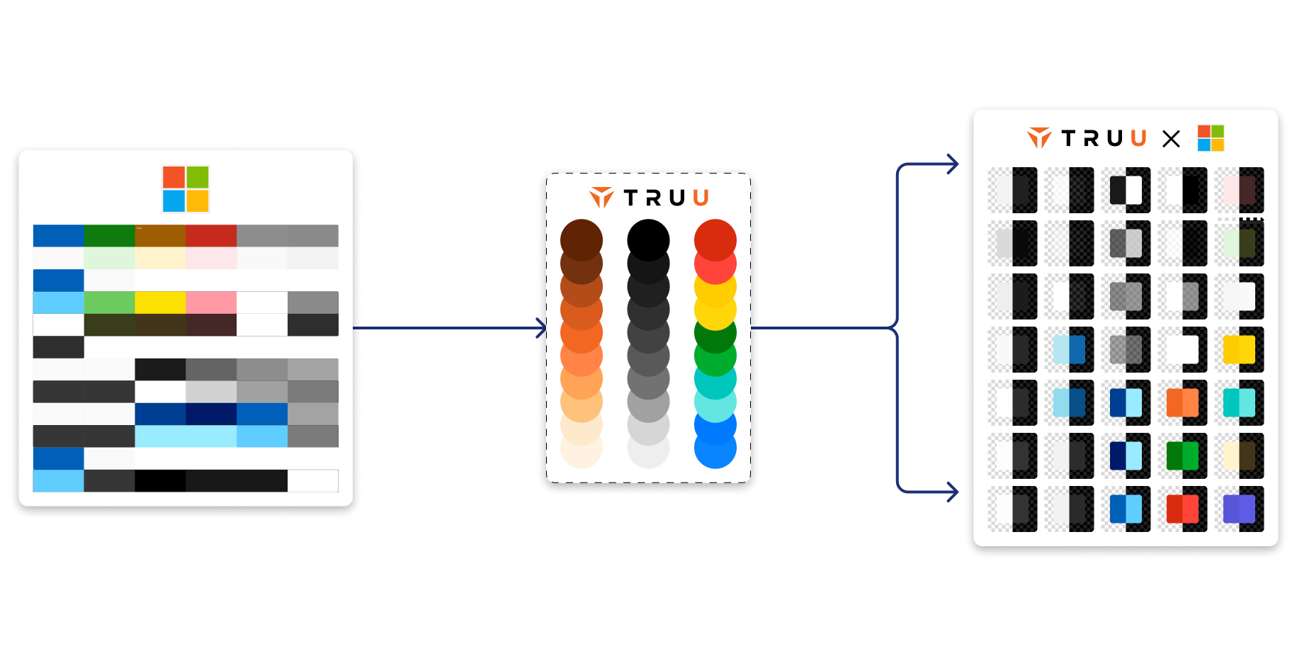
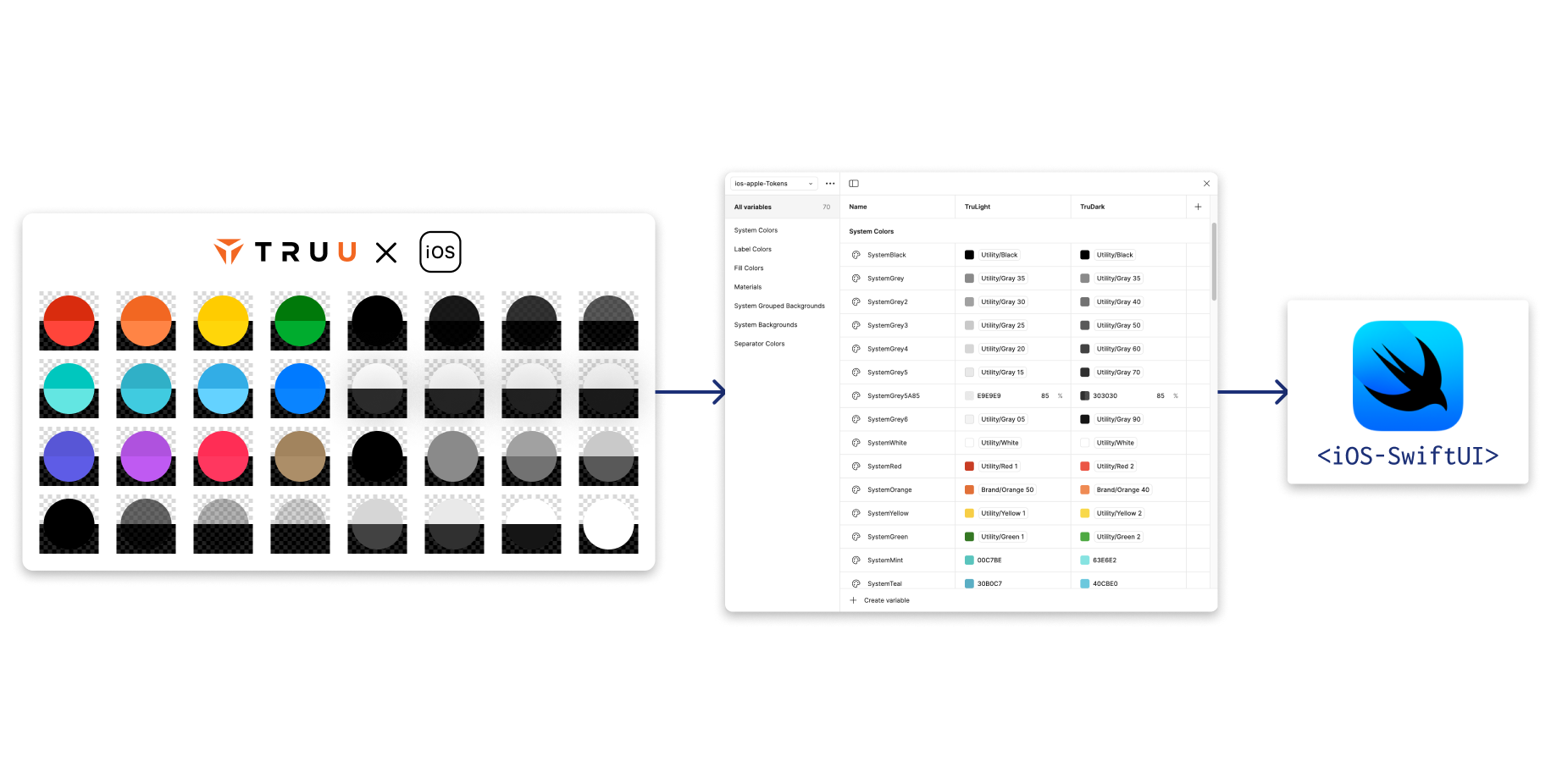
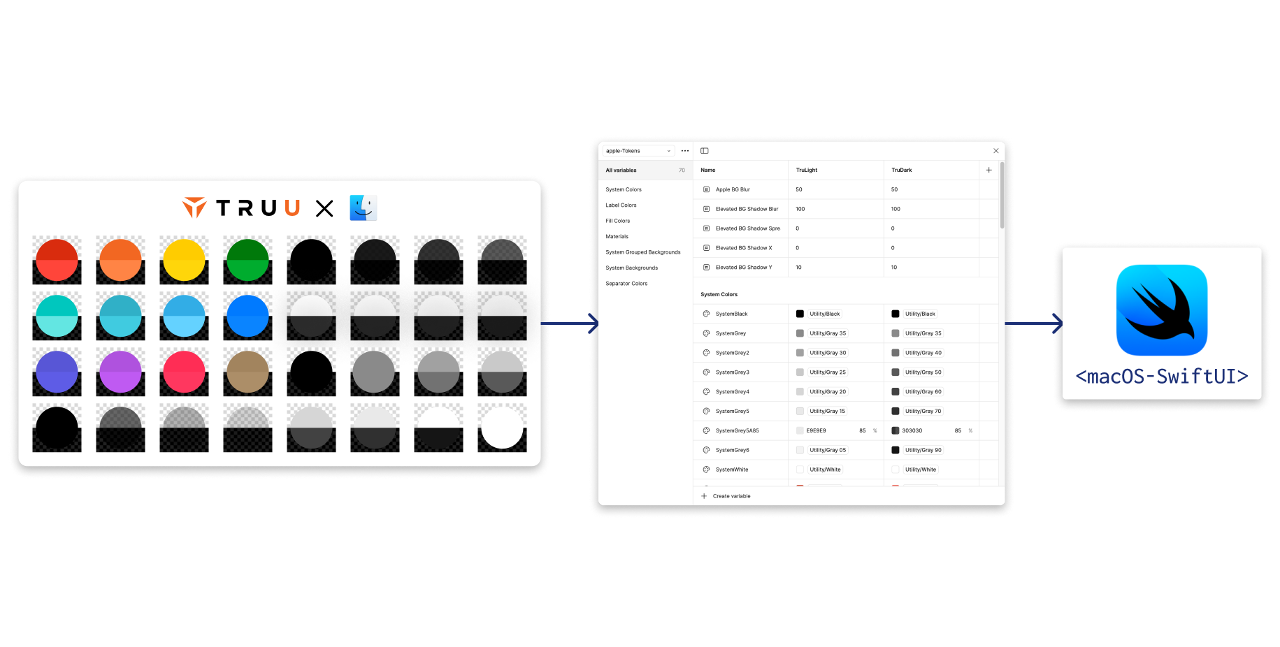
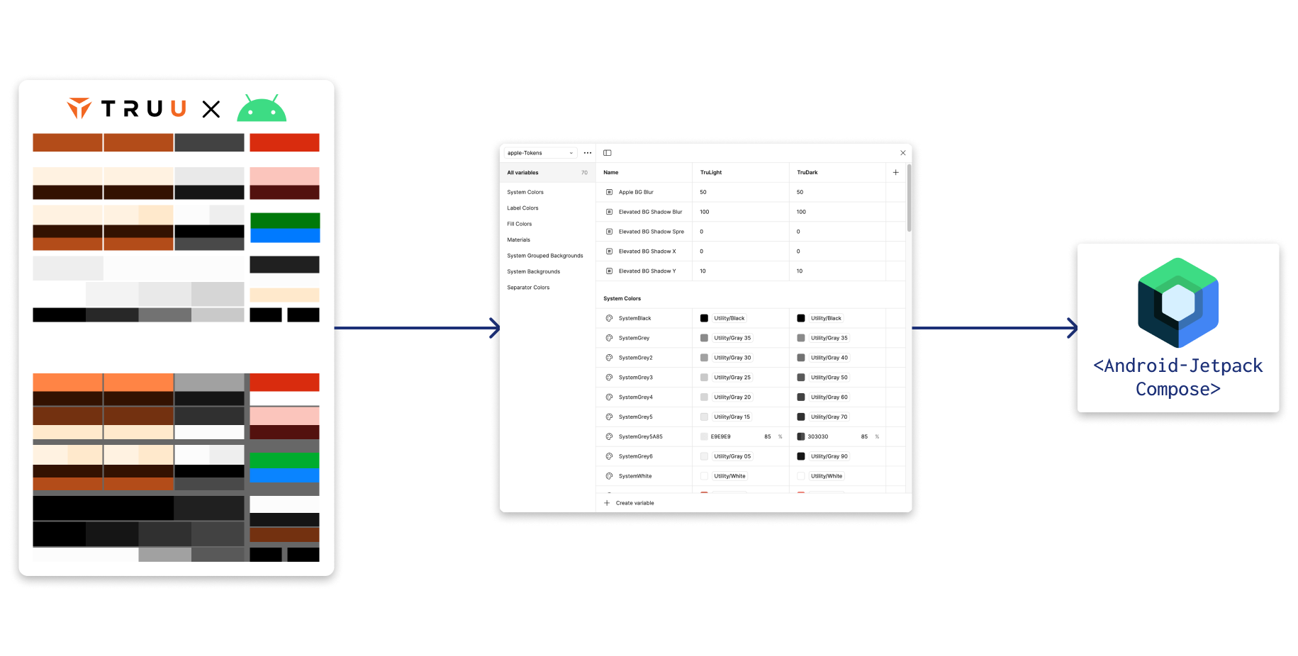
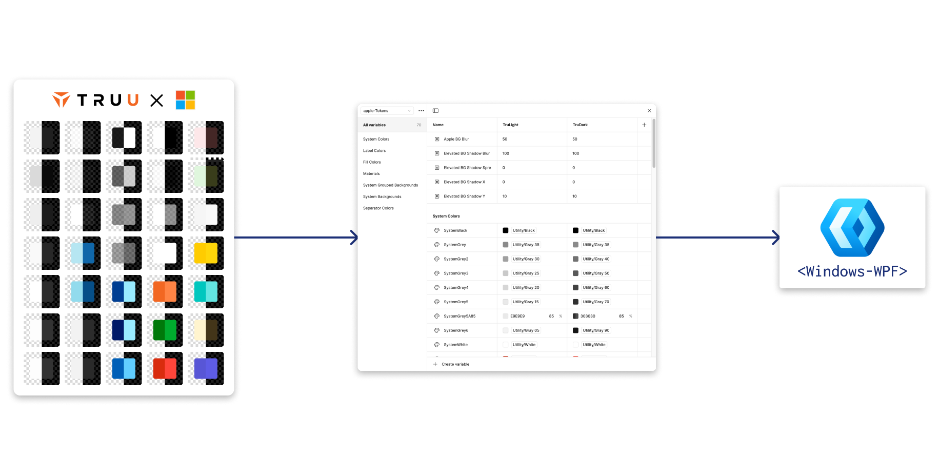
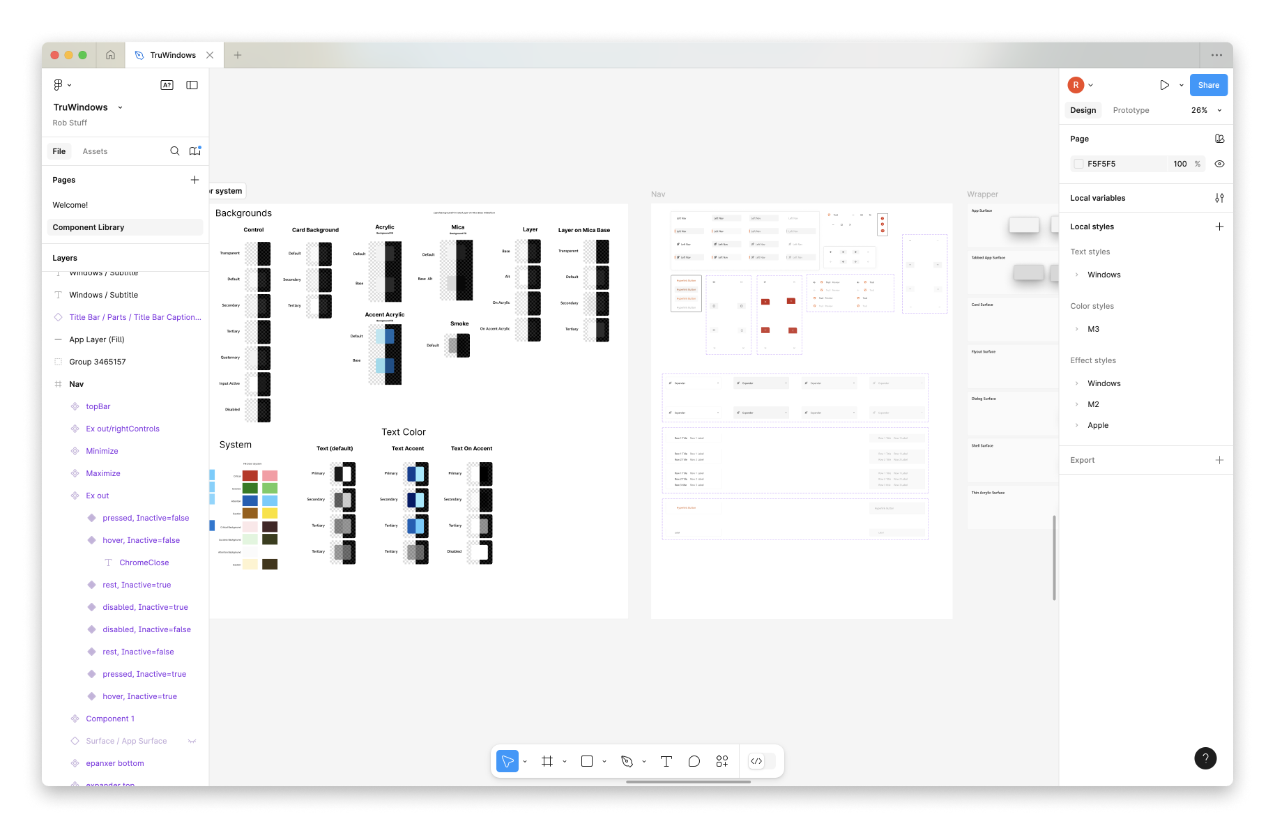
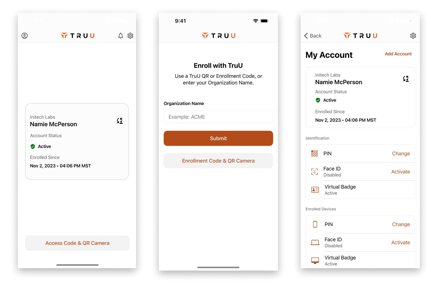
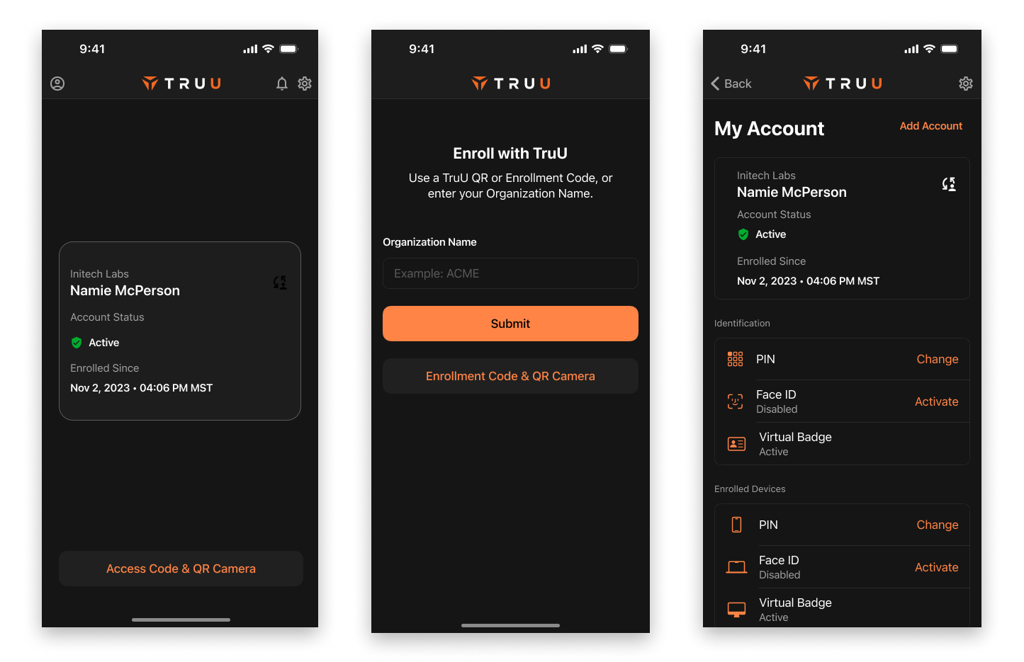
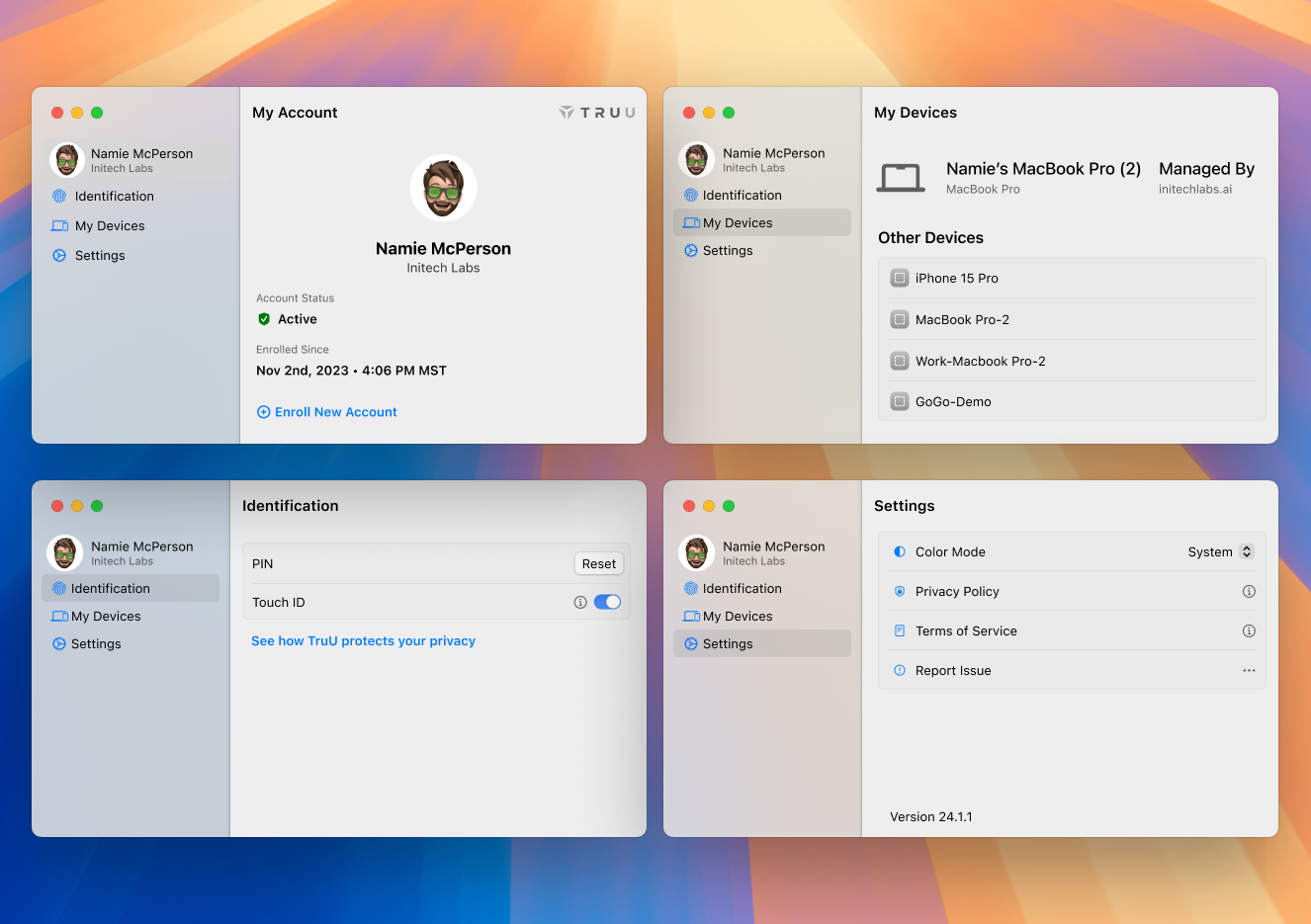
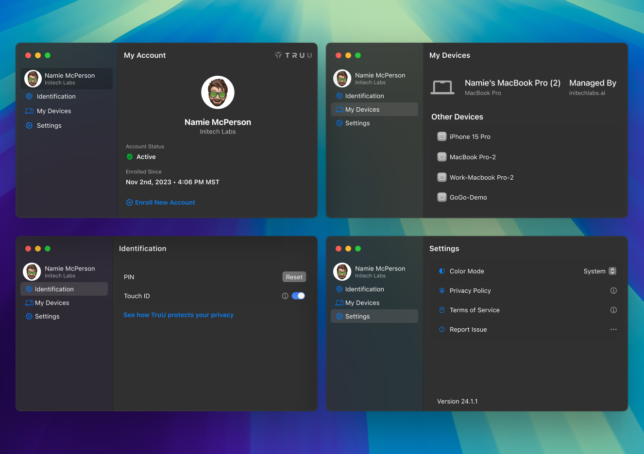
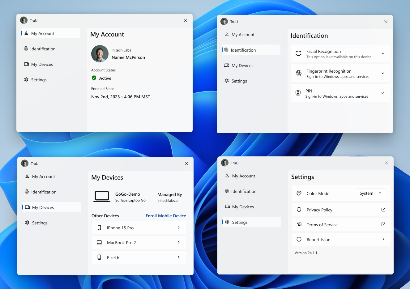
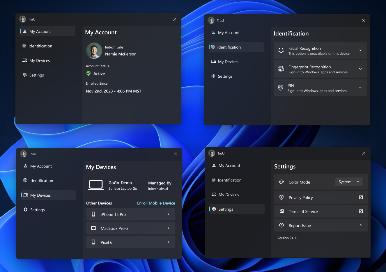
On theming ... Apple, Windows and Android OS products all have light / dark themes built in. I thought it would be clever to mimic how they approach these themes for their own OS, and organize our design system in a complementary form. That way, we could essentially take our new light/dark theme, and tweak it to be a different light/dark theme. Everything would be systemized, so we wouldn't start from scratch with each additional theme.
I had an idea that ran parallel to the old tablecloth trick. You know, the one where a person quickly pulls out a tablecloth from a set table, and the plates remain in place. My thought was to think of all the native components like buttons, text fields, etc. as the dishes, and switch out the color system as if it was a tablecloth. Here's how that worked.
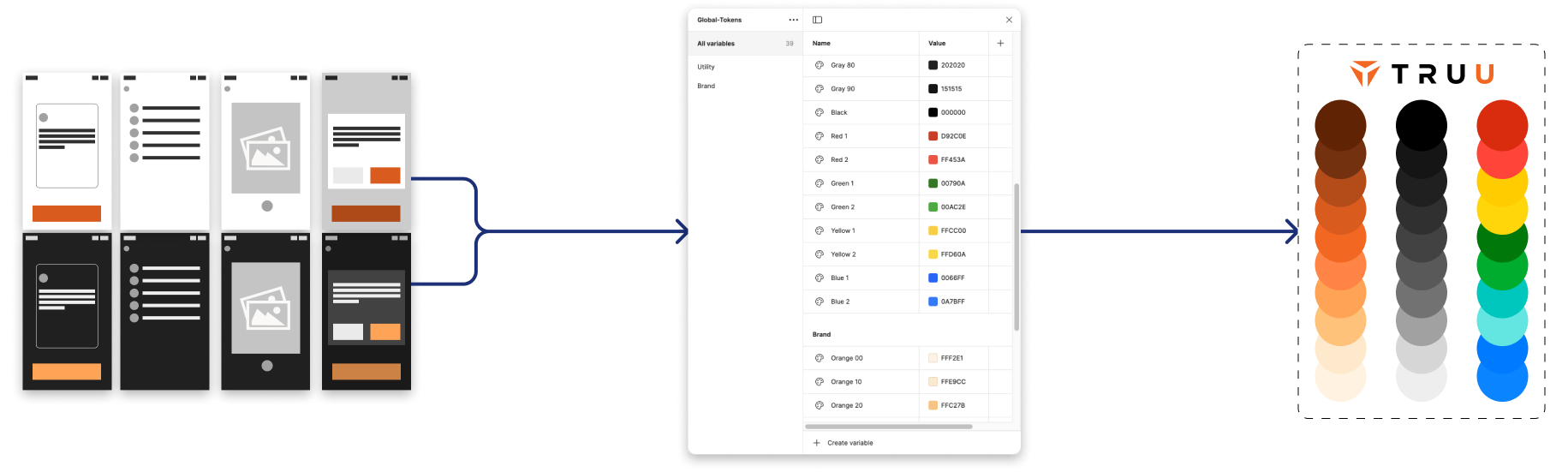
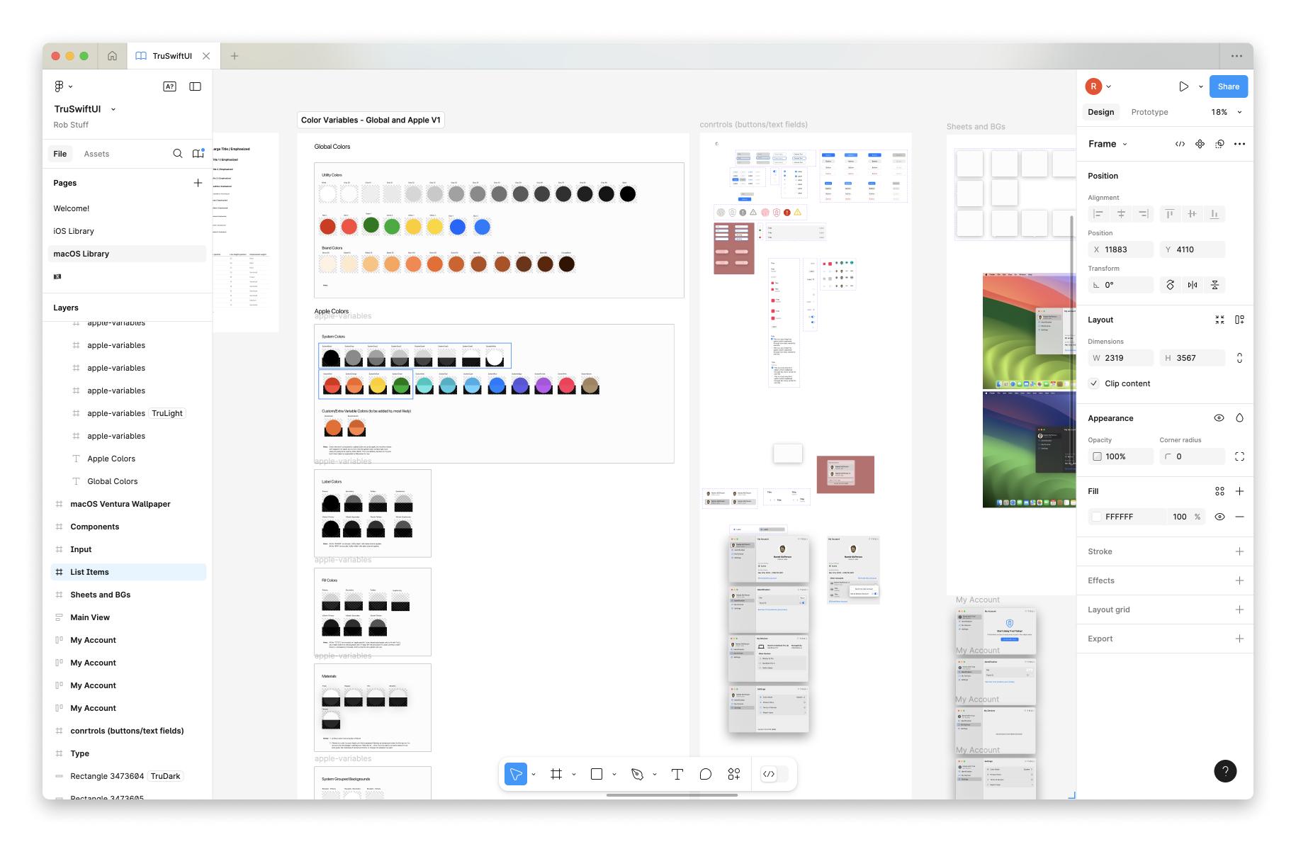
In Figma, I created a TruU specific Color Pallet. To start, I made a few pages of UI to flesh out a semi-full "blank" app. This gave me a functional set of neutral grays and brand colors to work with.
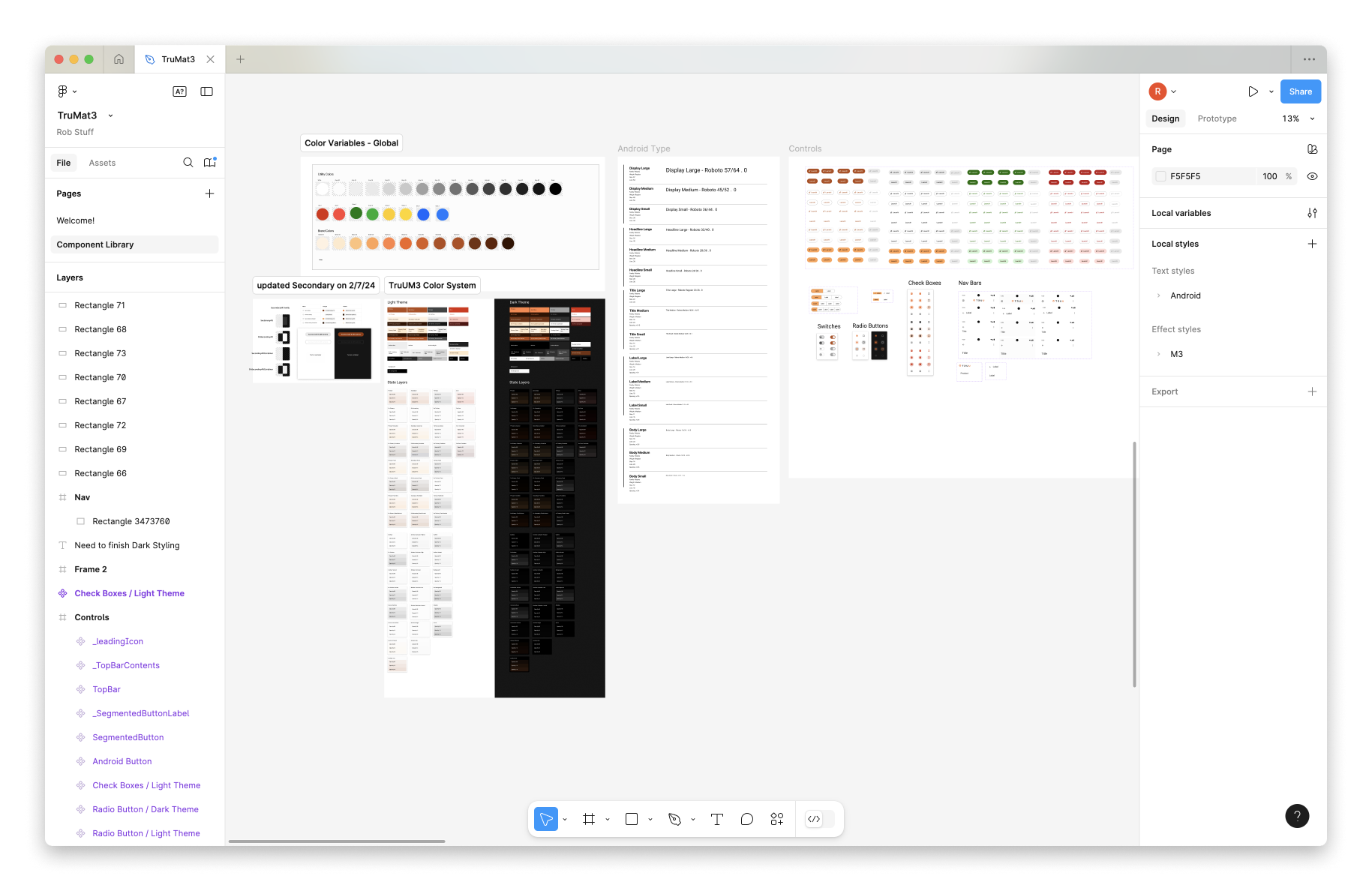
In Figma, I cloned Windows, macOS, iOS, Android color styles - organizing with variables mapping to light and dark themes. I then replaced all system colors with TruU color - keeping the nomenclature identical.
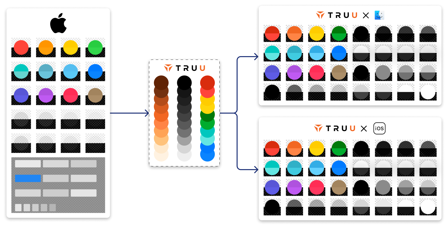
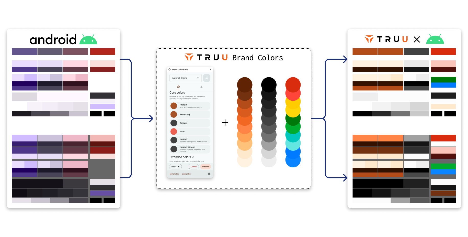
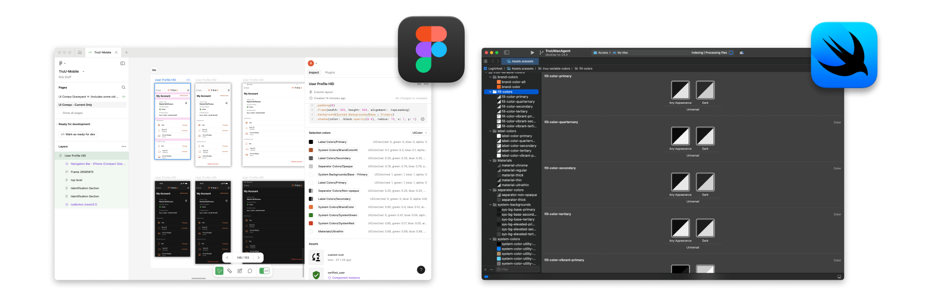
Figma had recently released variables into beta, and I was an early adopter. I translated all my light/dark themes into the new variable feature so I could make all UI once - easily transitioning between light and dark as needed. This was a huge efficiency booster for UI creation, QA-ing my work as I went, and for developer handoff. Although iOS ands macOS started with identical Asset Catalogs, I ended up cloning them in Figma to allow for the two teams to not be tied together. The macOS and iOS team leads had slightly different approaches, and this method allowed me the flexibility to support them individually.
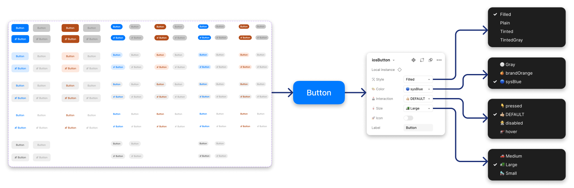
After I set the color systems and collaborated with all dev teams individually to get buy-in, I felt confident I could start producing a Component Library that would make theming a cake walk. As much as I wanted to spend time crafting all the pieces, I was limited by time. As a team of one, I needed to support a lot of ongoing fire drills. I was also working as Product Owner for iOS and Android, so my hands were full. I focused on the most used elements like buttons and text fields, and chipped away as dev teams actually had capacity to build what I was designing. This was the definition of lean design.
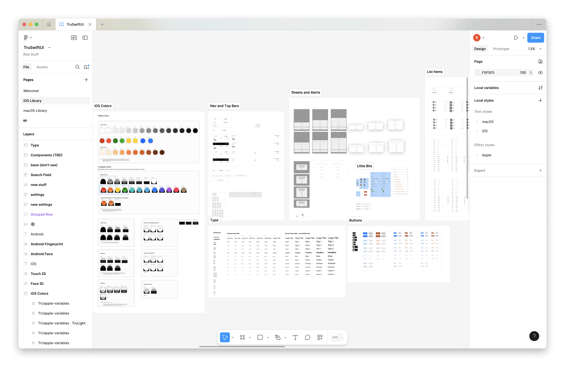
My focus was primarily on creating a functional color system that could be coded with confidence ... But designers are actually the end user of a Figma design system, so I did some work to streamline that as well. I haven't seen this done before, but I started using emojis in the style dropdown menus when possible. This made it much easier to glance at the parameters, and understand what variant was currently selected. A small tweak, but one that made my life a little easier when using the libraries.
Working closely with the development teams enabled us to put a lot of work on autopilot. While components like buttons could be reused, the 1 to 1 color naming in Figma and Code made theming easy and the visual feel of the app consistent.
I think this was a clever way to extend my abilities and to juggle a lot of design efforts as a team of one. I replaced a team of 3, and set a solid foundation to build stable, scalable, and theme-able products. I started without much in the way of style documentation, and set up future designers for success. I will dig deeper into the redesign of each of our clients in separate projects, but I'll show some high-level before and after comps here.
Creating this design system set a foundation - but it wasn't complete at the time I left. Thinking about the levels of systems above, this one turned out to be a hybrid of a Semantic Design System and Design + Code Library. The semantic color system was fully baked and in production on most platforms, with only Windows lagging in full adoption. Component libraries had been started, but still had work to be done. All in all, this boosted my productivity and made theming a passive effort for developers. We brought sporadic style usage in to a cohesive brand while elevating the UI across the board. This was a fun project, and I was proud to leave design in a better place than where I found it.
